Author: Chuchu Zheng

  • Positions through triangulating

    Positions through triangulating

    Week1 Blog

    Since the direction of week 1 failed and subsequent developments did not follow that direction, you can skip to the week 1 summary reading.
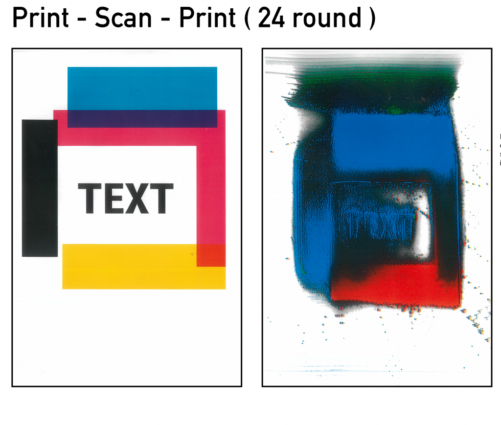
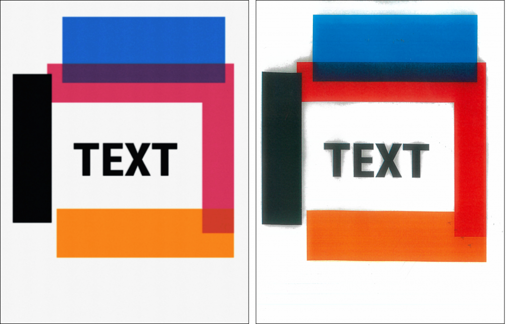
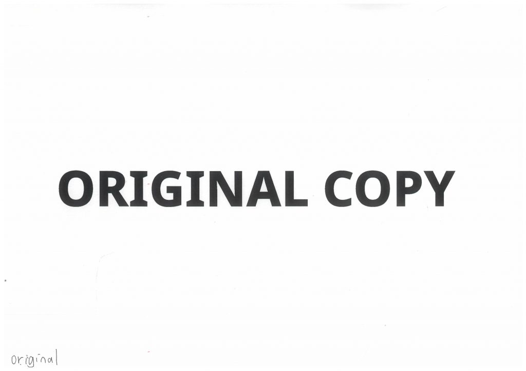
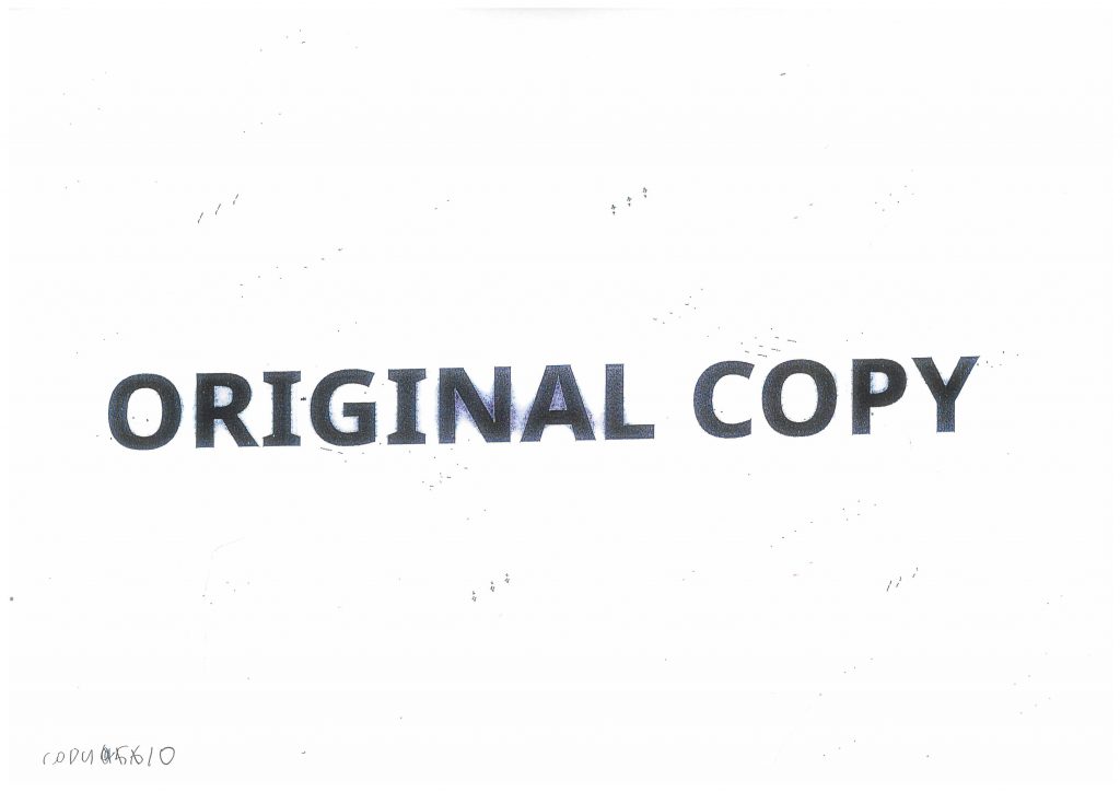
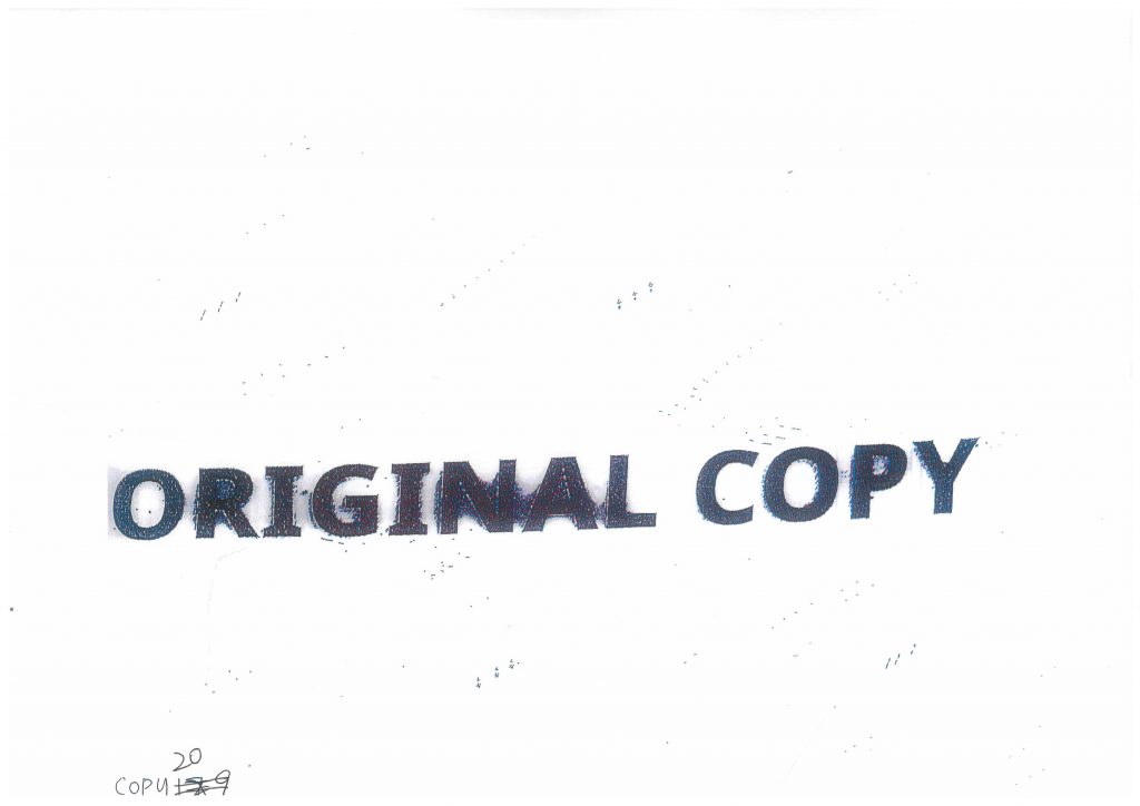
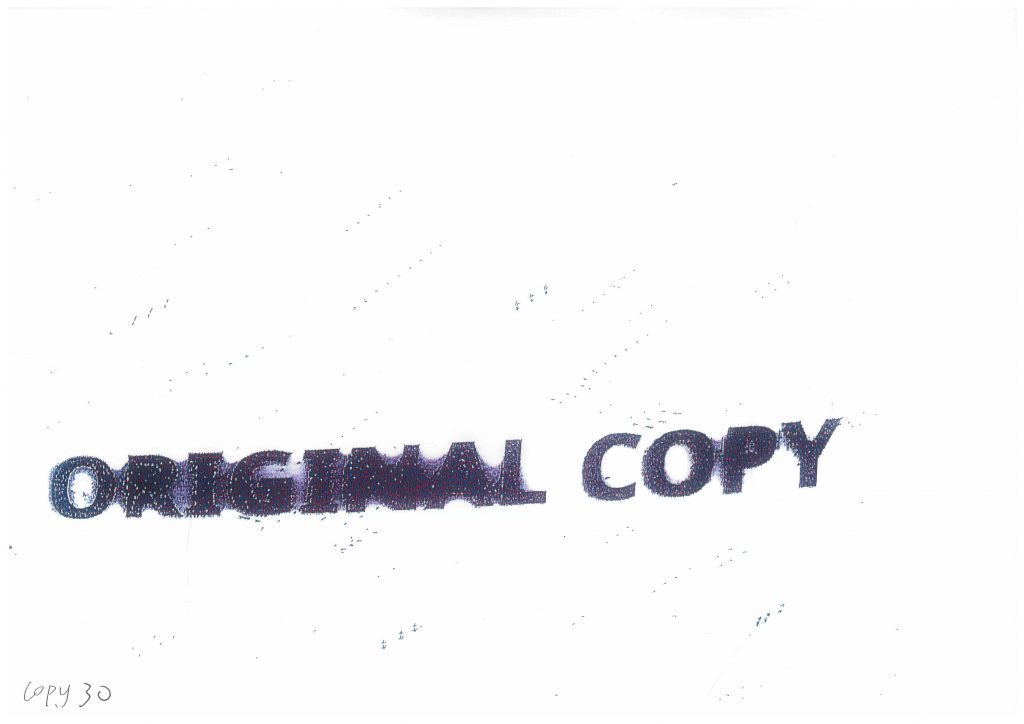
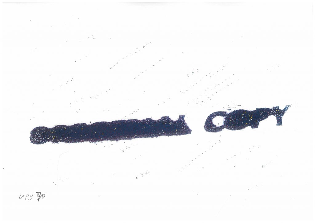
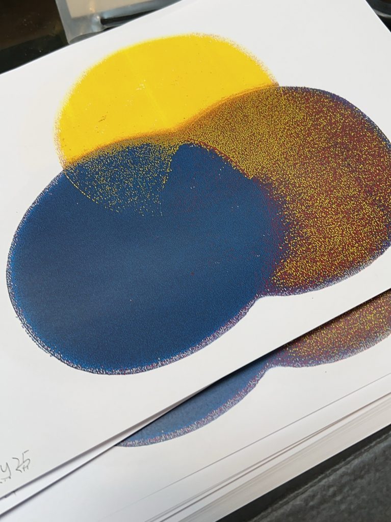
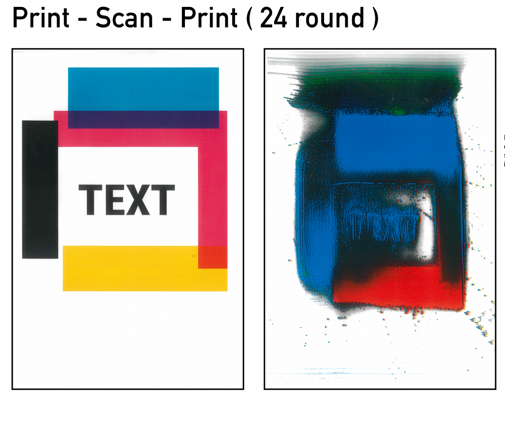
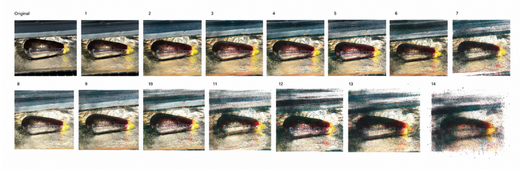
    In the “Positions through iterating” project, I investigated how errors are generated between the laser printer and the scanner. This is the result of one of the experiments, where the image was shuttled between scanning and printing 24 times.
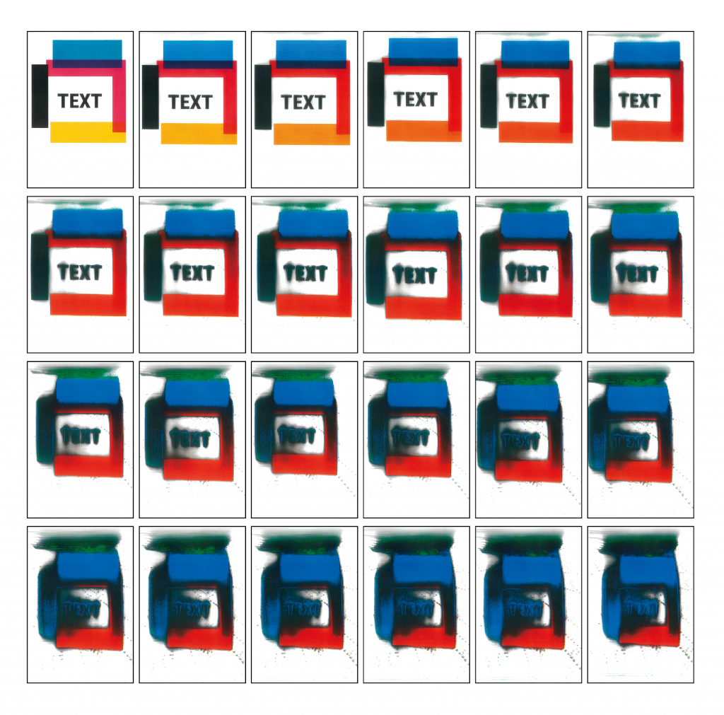
    This is the process of changing the original image 24 times through the scanning and printing process.

    I want to know if AI, being a machine, can understand the processes of scanners, computers, and printers, and use programming to replicate the iterative effects.
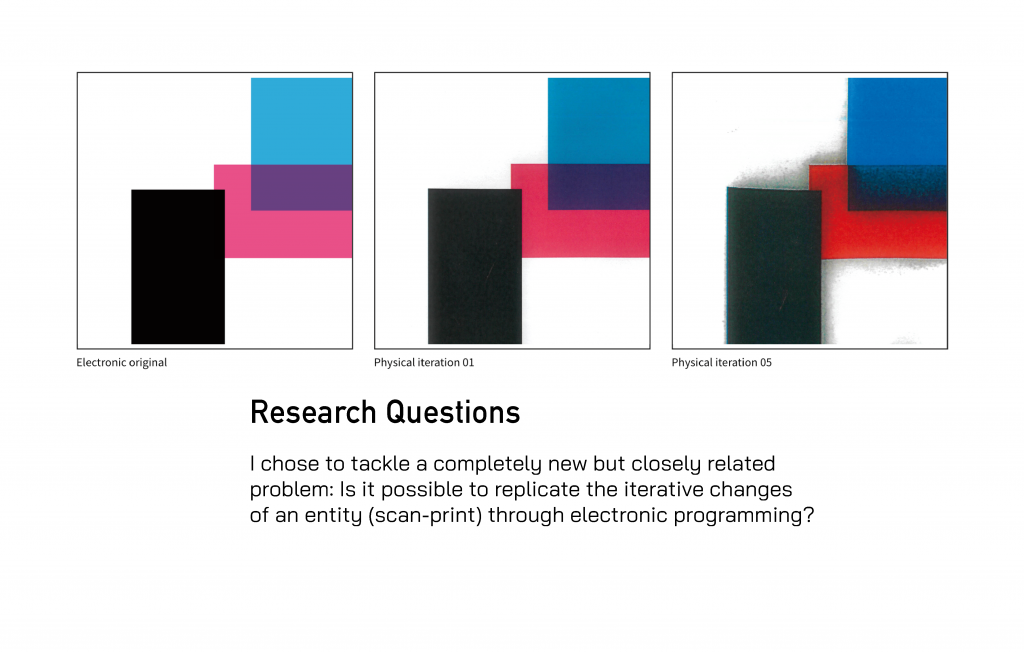
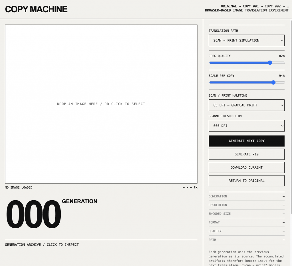
    I first had the AI ​​build a basic website framework. Unnecessary parts were then removed via commands. Because my focus was on how to generate iterative effects from images using the computer, I didn’t delve too deeply into the web design itself.
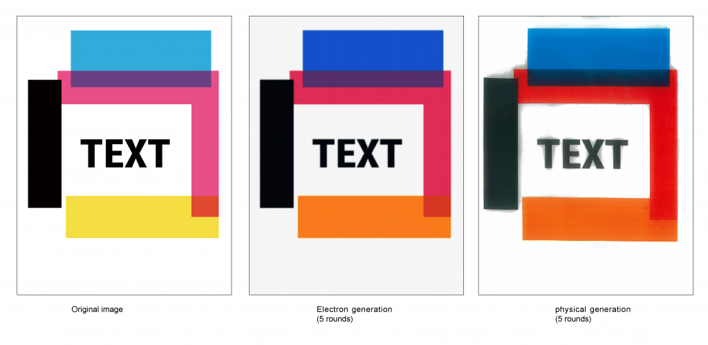
    This is the first time I’ve used the effect generated by the website. The image has turned gray and has been blurred overall.

    However, the fusion in reality is not a complete blurring. Rather, after the overall hue changes, the colors diffuse outwards according to certain rules.
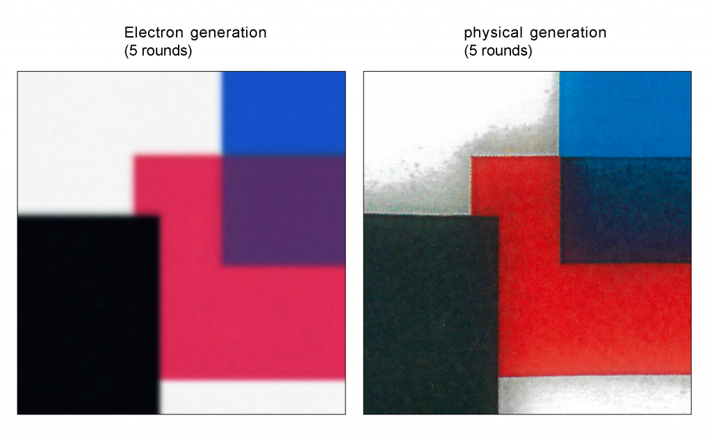
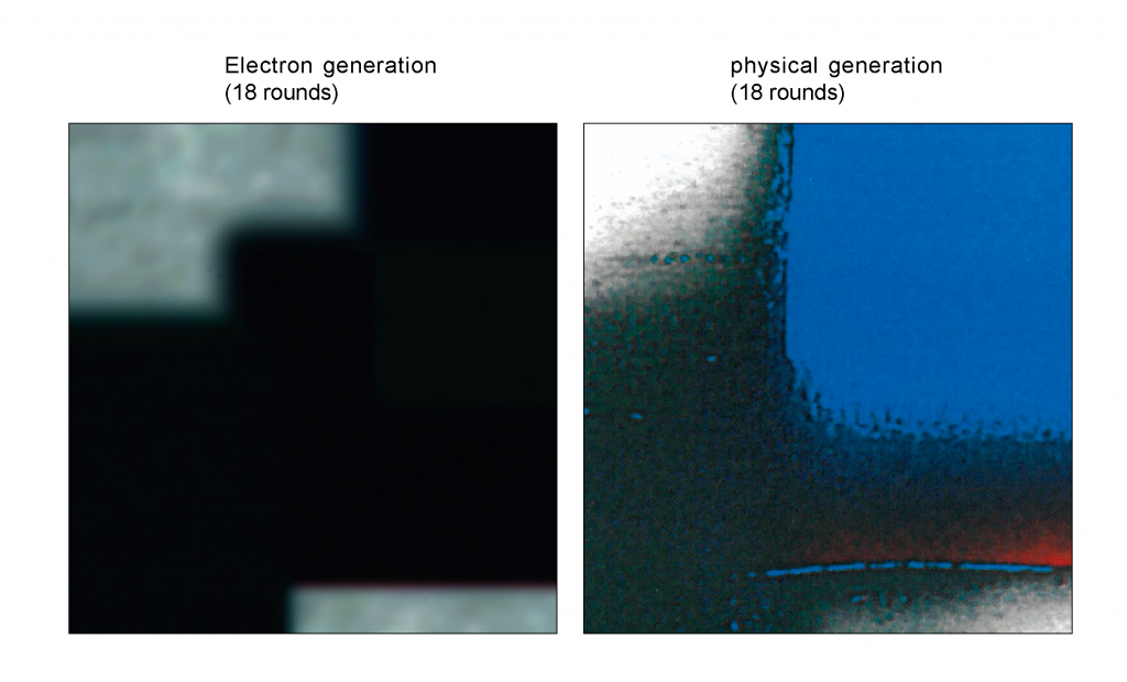
    I tried providing more instructions: removing the overall blur, adding hue changes, inI gave them more instructions: remove the overall blur, add hue changes, enhance internal color blending, and increase exposure. However, the effect was still limited; while the colors were closer to the original image, the most important changes were still missing.

    I tried breaking down my physical printing process and having AI simulate some elements of that process, requiring entirely new programming.
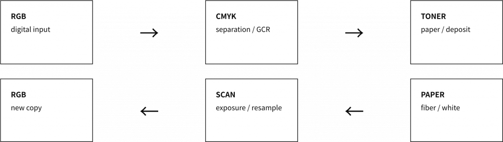
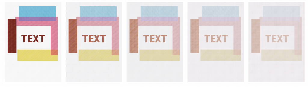
    However, the test results were still incorrect. So I tried to break these processes down and then import them back into the original program for testing.
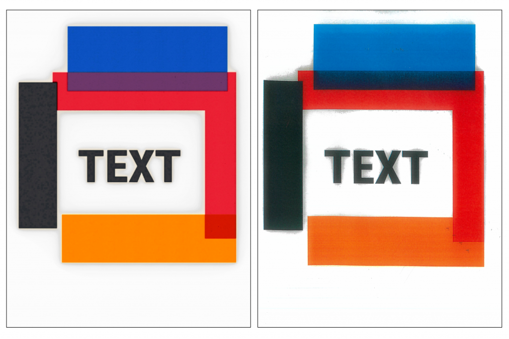
    Meanwhile, instead of using website programming for iteration, I tried generating the data directly with AI, but perhaps due to insufficient data, the AI ​​was unable to calculate the final effect after the iteration.
    Summary

    Therefore, I believe that reproduction is the process by which a medium analyzes the original work using its inherent interpretive methods, and then reproduces the analyzed original work using its inherent means. In this process, the reproduction will inevitably be altered by the inherent properties of the medium itself.

    Feedback

    My advisor and classmates all agree that the changes produced naturally by the machines are more interesting than the results calculated by AI. I’m trying to create a book to illustrate these experiments and use these iterative techniques.
    week 2

    Based on the feedback, I began working on the book. My first step was to plan the overall content of the book.

    It is mainly divided into five parts

    Machine → Translation → Iteration → Error → New Image

    Page 1 Original copy (book name)

    Pages 2-3

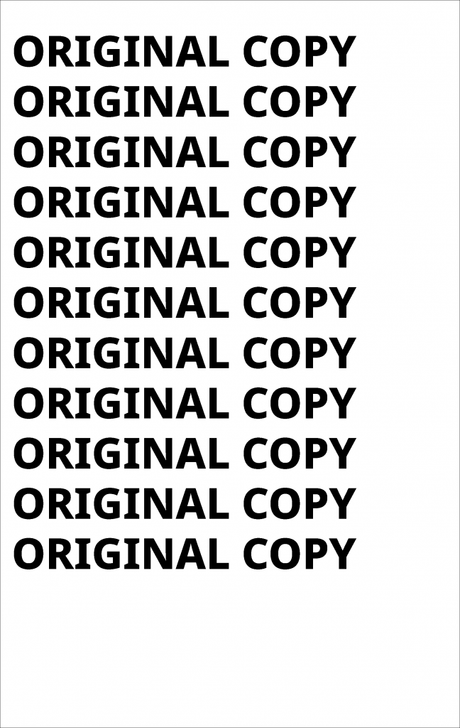
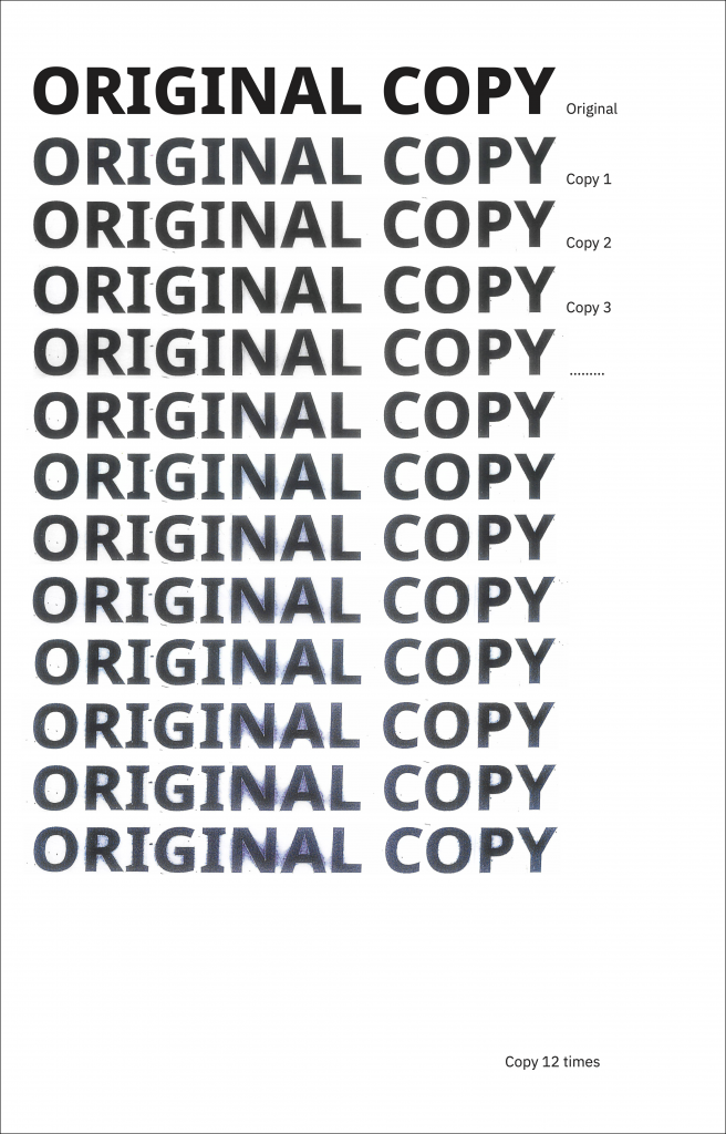
    (showing some text transformed through iteration) Book overview (Machine → Translation → Iteration → Error → New Image)

    Page 4 What is a Copy?
    Copy is defined as… (Quote, introducing the main text: What is the generally accepted definition of copying?) → (Introduce my definition) Copying is… (Quote an argument).

    Pages 5-6 Introduction to laser printers

    Pages 7-8 Introduction to scanners, introduction to computers

    Page 9 (Question) What will we get if we keep copying with them?

    Page 10 Single large image (Later experimental image, answering the previous question through images)

    “Reduce text descriptions in the experimental section later”

    Pages 11-18 (More pages possible) Scanning and printing experiments

    Pages 19-30 (More pages possible) After CMYK is separated

    Pages 31-40 Same system, different conditions LPI large and small and no LPI / Images of different complexity / CMYK separation and merging / Different DPI

    pages 41-46 Detailed digital archives: Machine traces

    pages 47-48 Summary Copying is not neutral; any copying is affected by the operator and the system. “Copy = Original + Machine + System + Operator
    Original + Machine + System + Operator + Iteration = new image (This part is tentative and may be modified)”

    page49 Appendix Supplementary information: Equipment model, experiment number setting rules, references, experiment procedure index, details: scanning DPI, print settings, LPI, paper in the experiment).
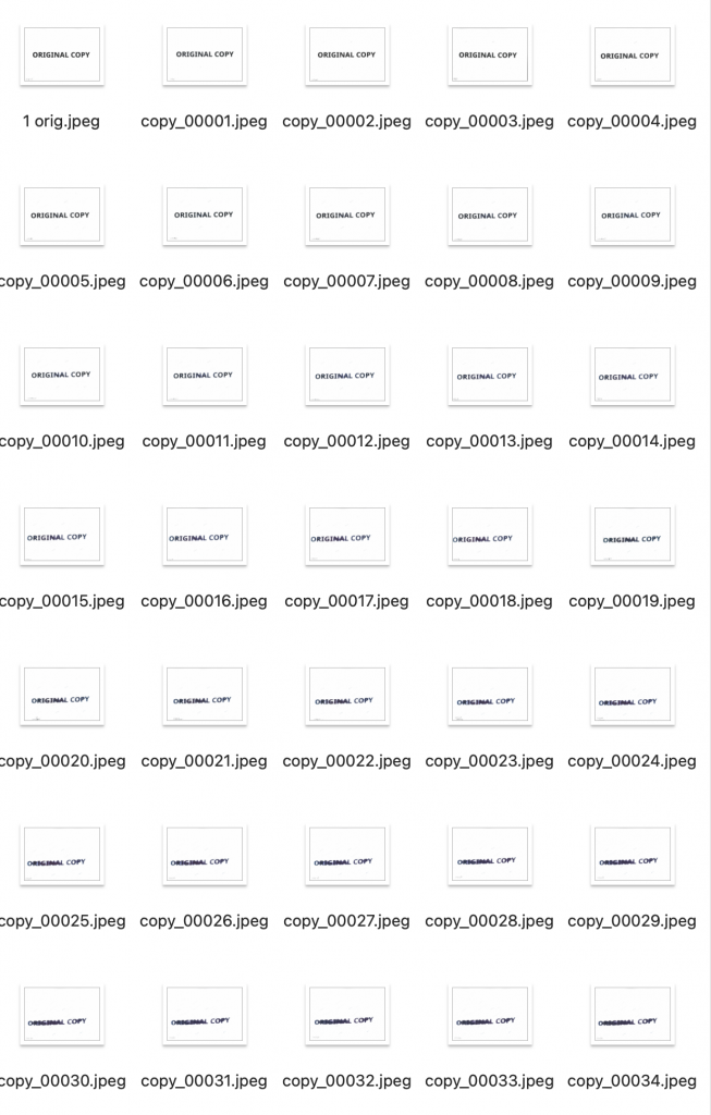
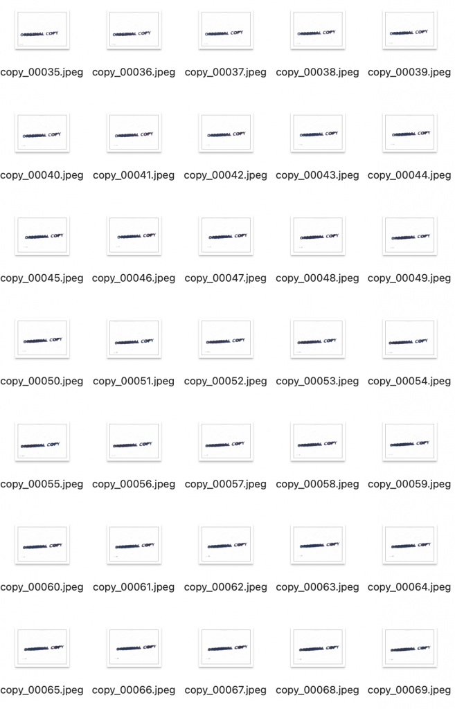
    I first designed the layout. Then I iterated on the printing process. Finally, I imported the images into the school administration system according to their positions in the layout.
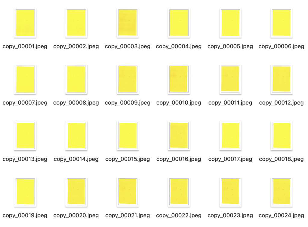
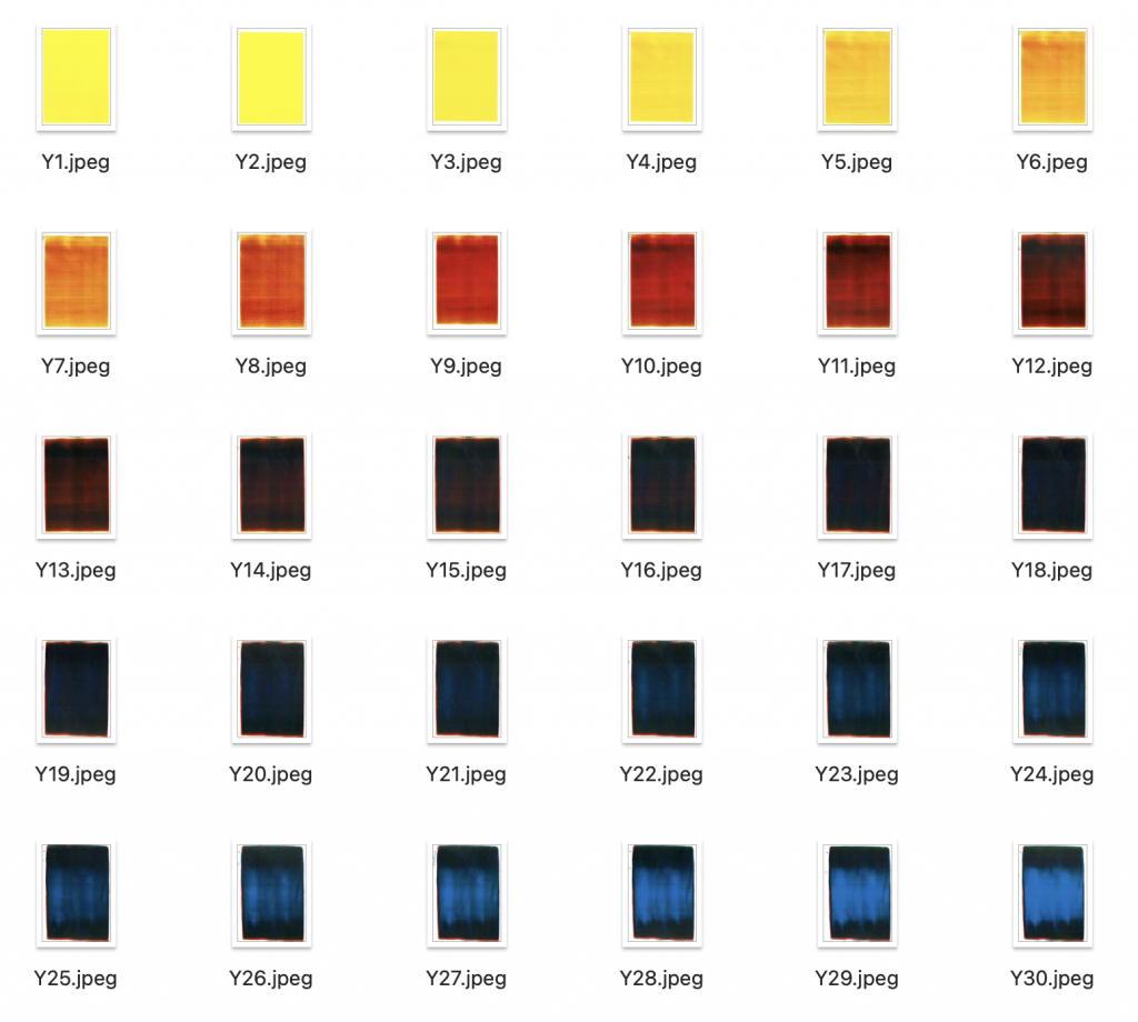
    In planning the book, I intended to showcase the individual iterative changes of the four colors C, M, Y, and K, so I first prepared the image materials for this part. To speed up printing, I used the printer’s copy function. I wanted to use the copy function to iterate everything uniformly before scanning. In the original iteration process, my steps were: scan, save to computer, upload to computer, print. The reason for this was that after planning the book content, I realized that preparing all the necessary images would be extremely time-consuming, and I might not have enough time to complete it. Therefore, I decided to speed up my work in this way. This also unexpectedly led me to discover that the results of copying and scanning are different.
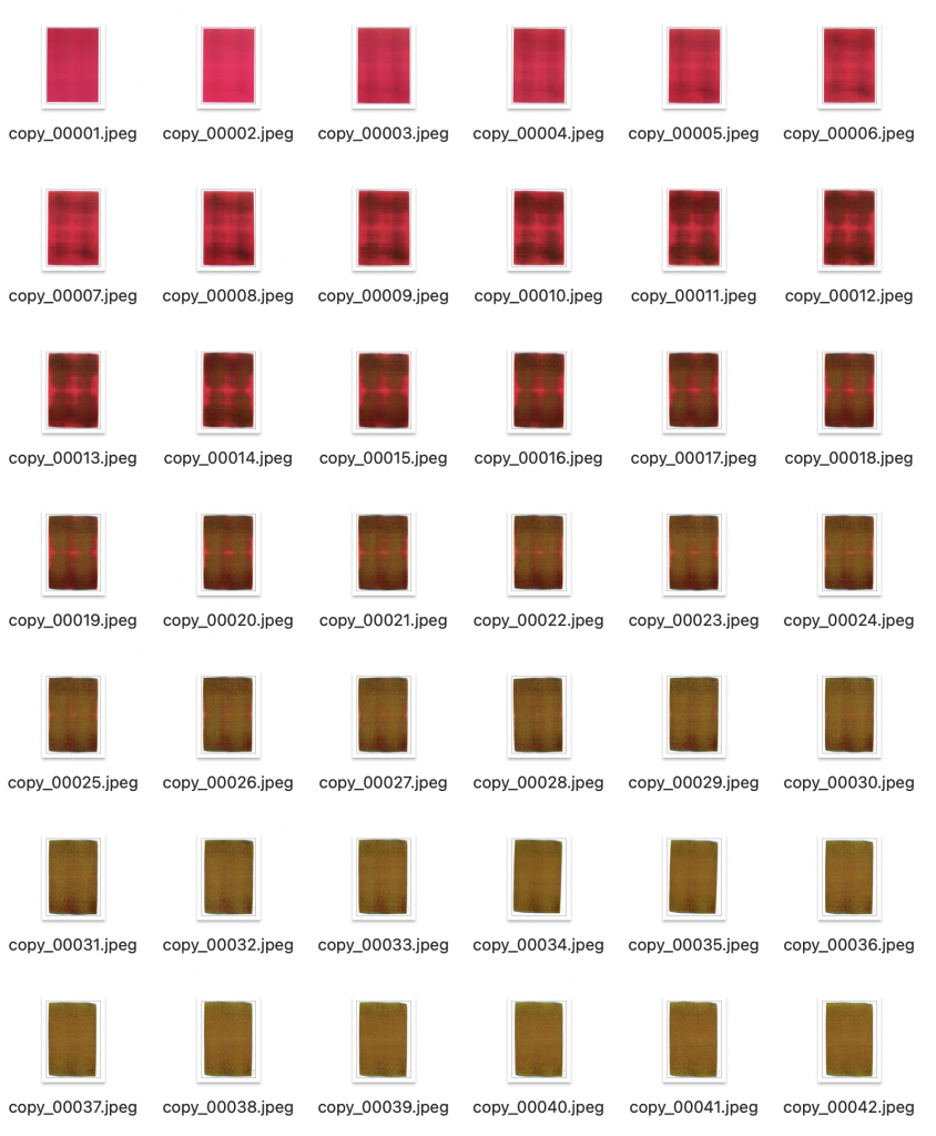
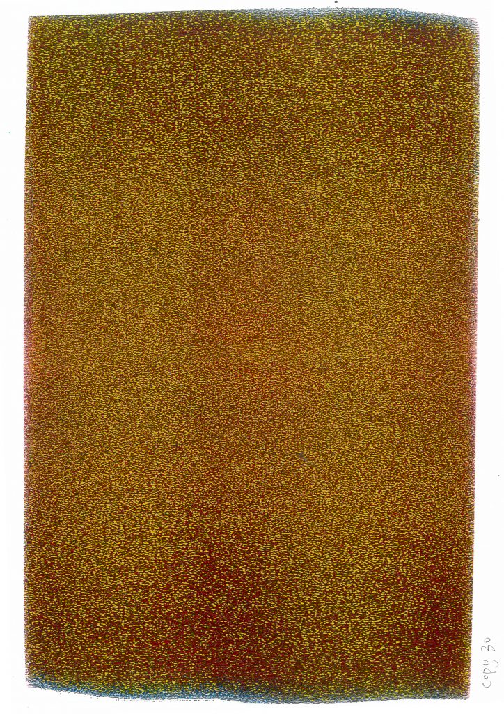
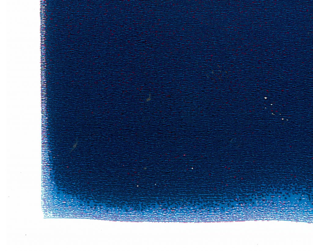
    After copying and iterating, the magenta color transformed into an image composed of a mixture of yellow, black, and red dots.
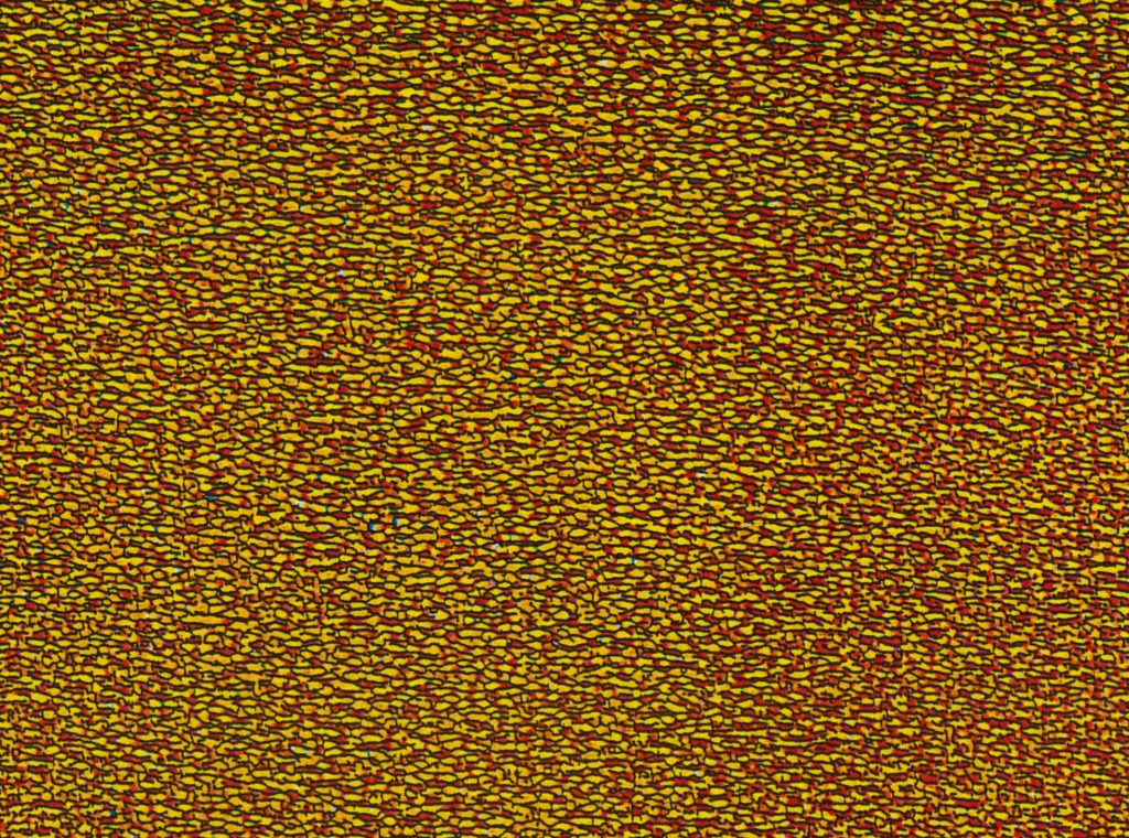
    Using the same machine and performing the same “copy” operation, scanning-upload-printing and copying yielded different results.
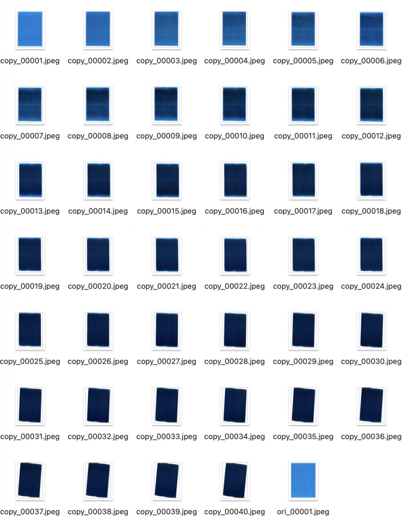
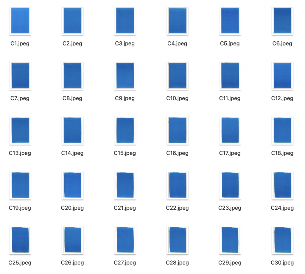
    The blue color also exhibits a mesh-like pattern. But what’s amazing is that these patterns stop changing after a certain number of iterations.
    The changes when using three colors are basically the same as those when using one color.
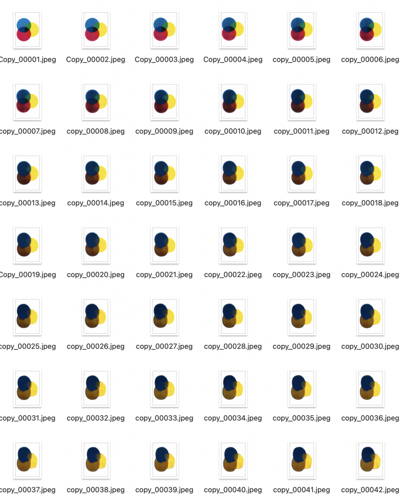
    In the Copy iteration mode, the yellow color remains unchanged.

    Feedback

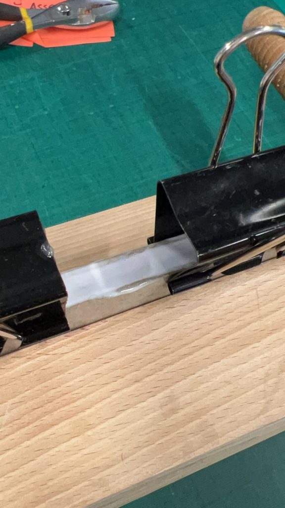
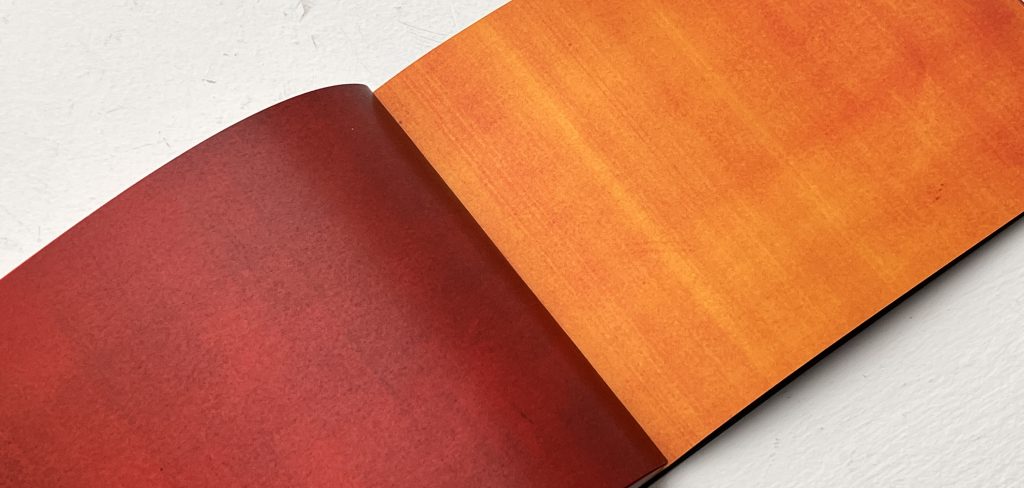
    Since this transformation process is also quite visually striking, we can consider showing this part separately. A detailed explanation in a book will be produced later.The tutor shared this binding as a reference.
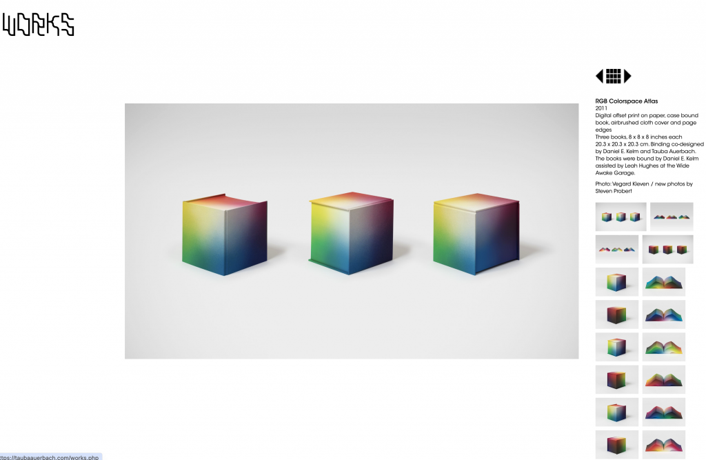
    Tauba Auerbach, RGB Colorspace Atlas, 2011 (Auerbach, 2011).
    Week3

    In the third week, I repeated the experiment I had planned for the second week. The results were quite surprising: regardless of the color, after 30 iterations, they all turned cyan. The cyan color, however, remained unchanged.
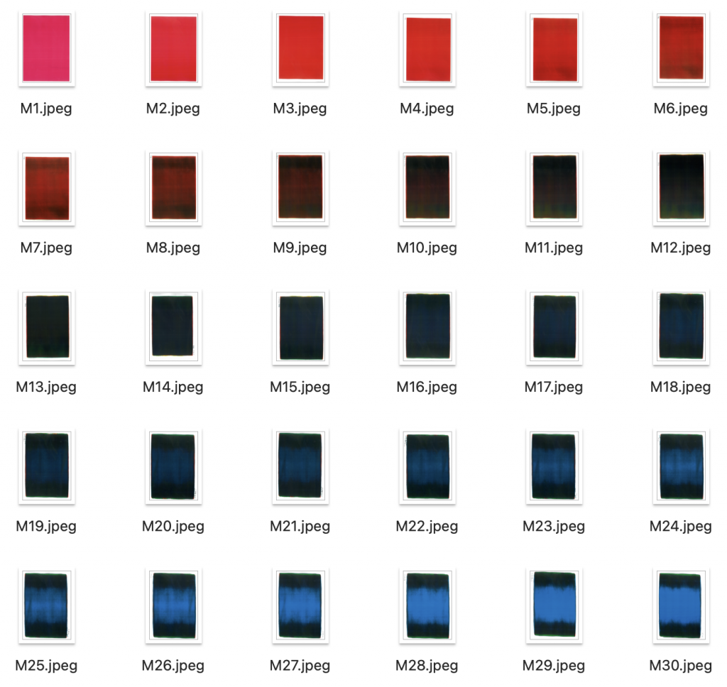
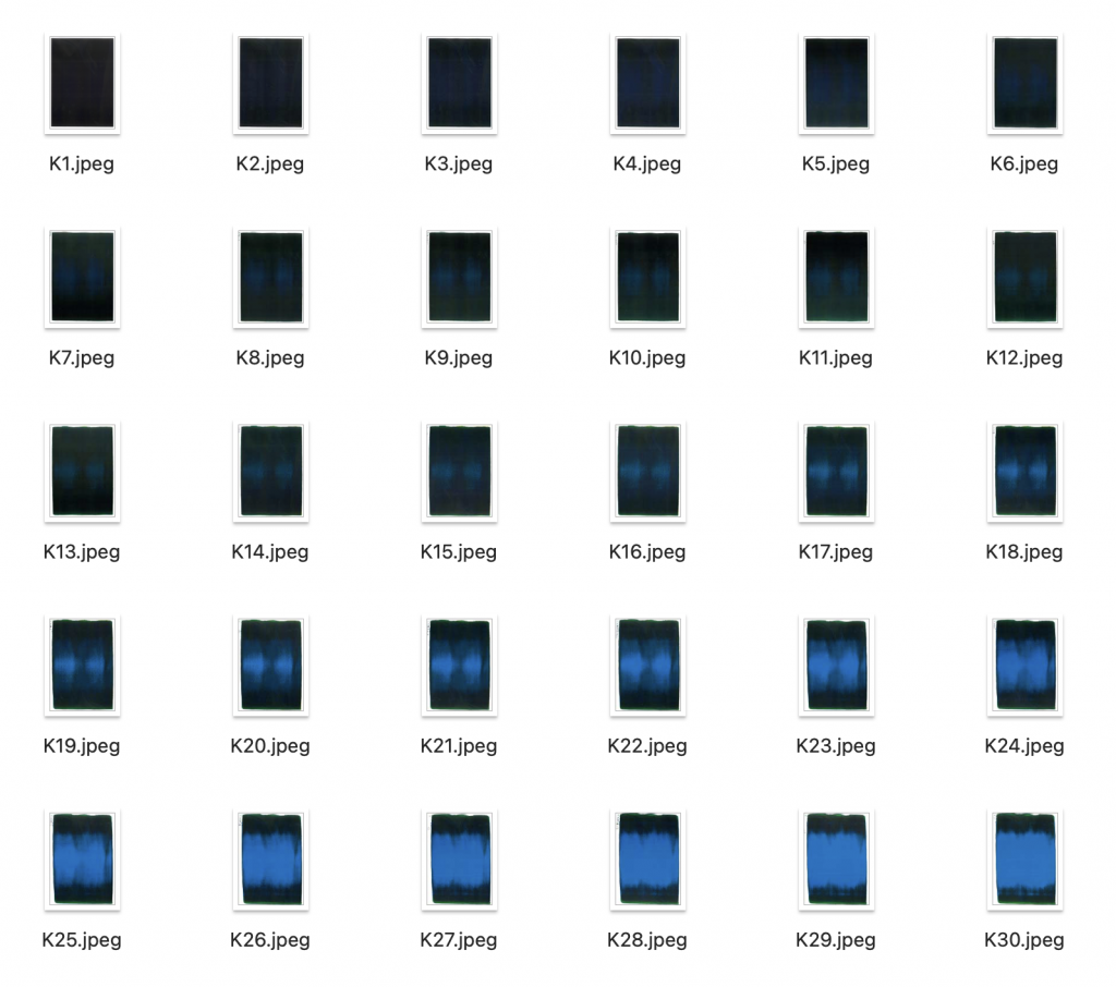
    This result differs from my experiment in Positions through iterating. Noticeably, in the same Scan- upload-Print experiment, after 24 iterations, yellow remained in a red state. I speculate that the colors influence each other. Adding a color might make it more stable or prolong its duration. My plan in the next experiment is to combine two colors together as input for iteration, testing the rate of change.
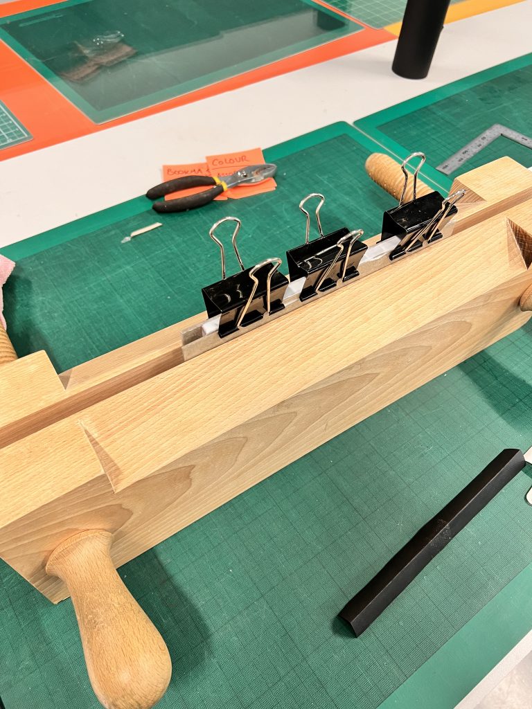
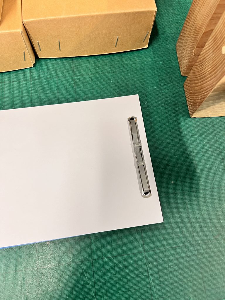
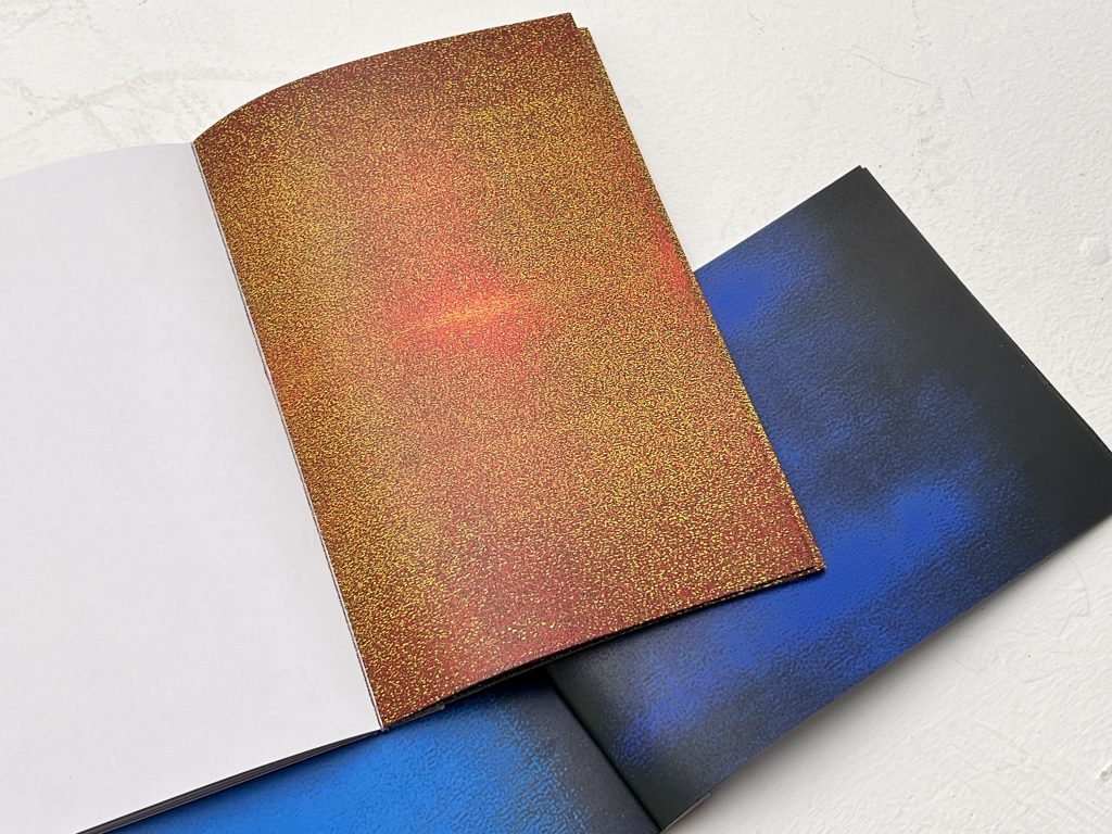
    The final product of this project will be bound into a book. Readers can observe the color iterations by flipping through the pages.

    copy book

    Scan -Upload- Print book

    Self-reflection

    This is a book shared by the studio teacher, made by a student from another grade.

    She also used a printer to iterate the image, and I think this presentation method allows for a clearer observation of the overall changes in the image. If the project were presented as a book, I think this style of using white space around the edges could be a good reference.

    Feedback

    My advisor suggested I use a flowchart on the cover to explain the changes in the images. But this made me think. Should I aim to reveal the system’s inherent characteristics, or to generate new characteristics through interaction with the system?
    Week4

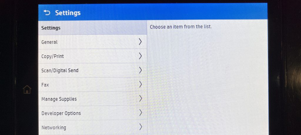
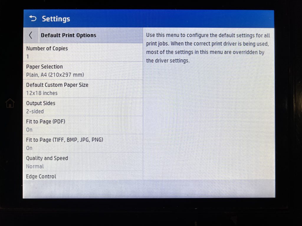
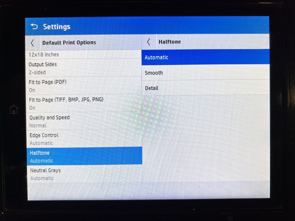
    After reviewing relevant literature and careful consideration, I re-examined the printer and found that it does indeed have internal color adjustment settings. However, these settings are more general and do not allow for precise numerical adjustments. Even so, this demonstrates the limitations of my earlier understanding.
    I initially believed my research was revealing the characteristics of the system. However, Lisa Gitelman’s Always Already New: Media, History, and the Data of Culture made me reconsider whether my experimental results stemmed from manufacturer settings or from the uniform, mechanical outcomes of today’s society, arising from the natural, iterative progression of history.
  • Positions through essaying

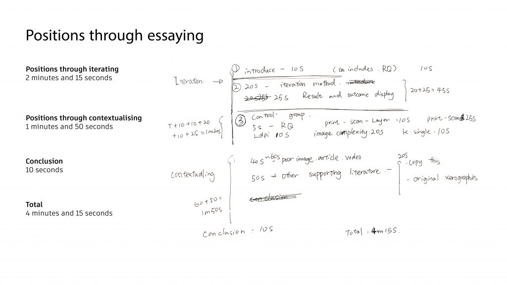
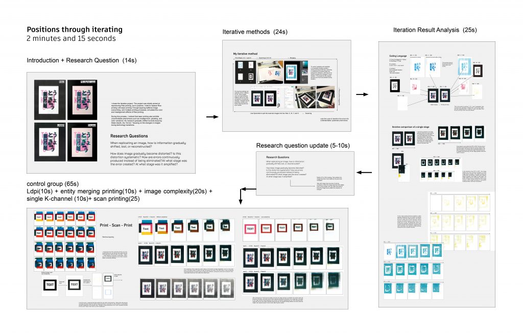
    Positions through essaying -zhengchuhcu- Unit

    The two links contain the same video content to prevent the links from becoming invalid.

    Weekly blog

  • Positions through contextualising

    week3.MOV

    ——————————-Weekly blog——————————–

    week 1

    During the first week, I didn’t quite understand the meaning of responding to the literature. Although I understood the production tips, I didn’t grasp their specific intent. So, this week’s process might have been a bit confusing because it wasn’t heading in the right direction.

    Previous experiments seemed to have reached a point where there was no further room for exploration. Inspired by literature on poor images, I began to consider the differences between my images and actual poor images. Therefore, I attempted to generate poor images from the internet, comparing and observing the variations in low-quality images on the web.

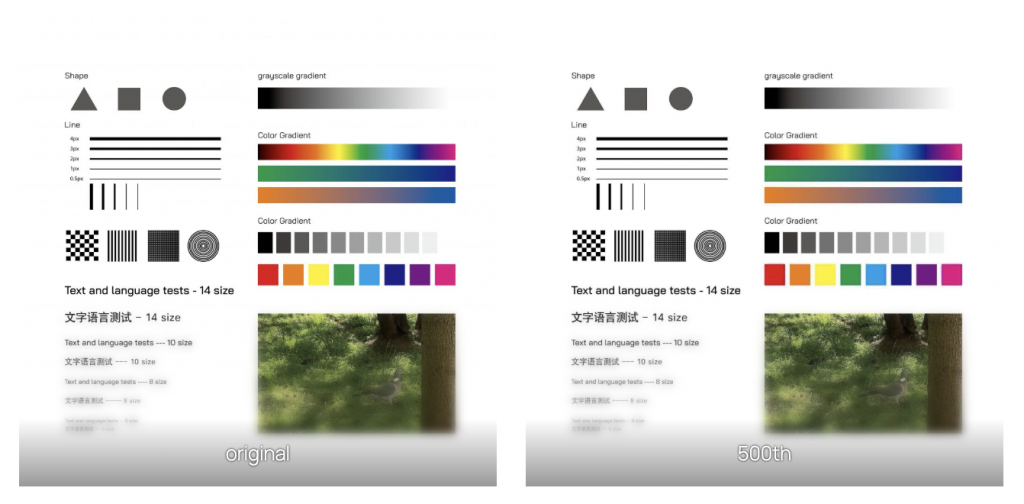
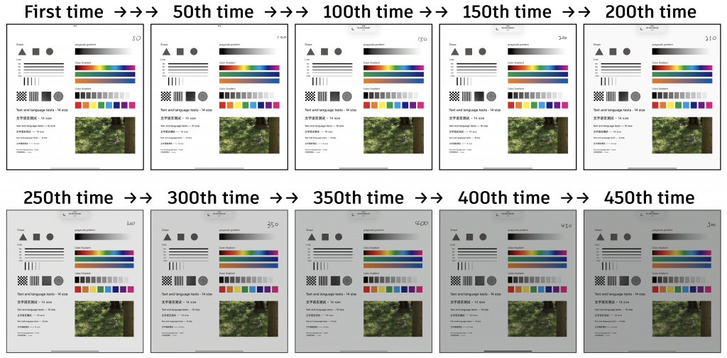
    Path A: Send WeChat → Save → Send again

    In fact, I don’t think I can see a significant difference. I think 500 times is probably too few. But through testing, I learned that the poor image is not generated by a small number of times, but rather formed through the transmission of information between a large number of people.

    Gray and black diffusion is relatively reduced. The edges of colored blocks diffuse and deteriorate more quickly. Perhaps black and white images have a longer lifespan during network transmission. Image details begin to blur during repeated transmissions, but structure remains. Gradients are compressed, resulting in coarser transitions. Colors are requantized during saving/sending.

    Path B: Screenshot → Screenshot → Screenshot

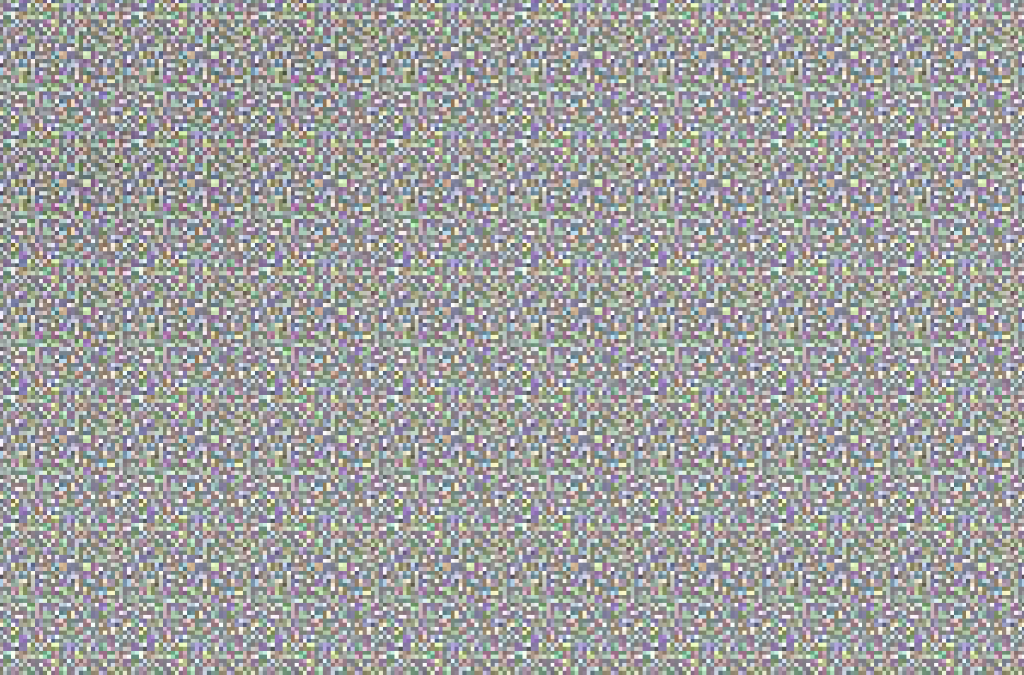
    The screenshot gradually turns gray. After some research, I discovered that screenshots are resamples of the screen content. The screen is composed of RGB subpixels. Because the alignment of pixels and subpixels cannot always be perfectly consistent, tiny sampling errors occur. These errors, accumulated over time, create a gray texture.

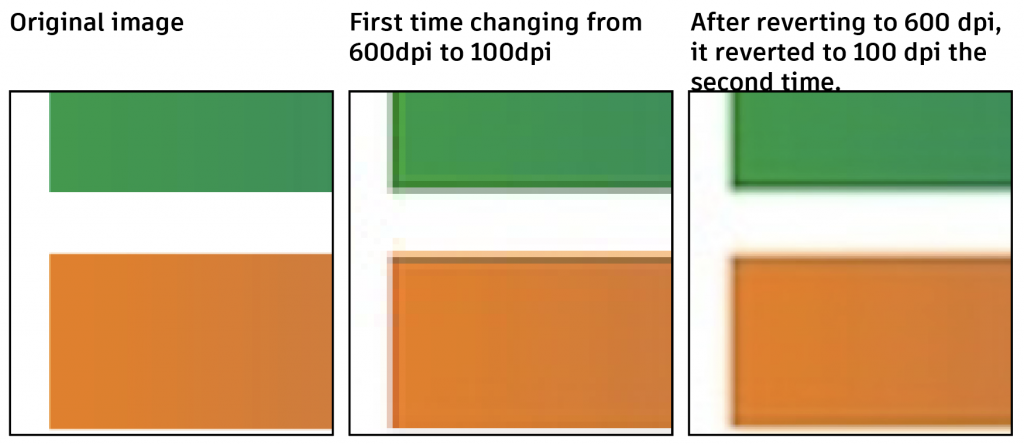
    Path C: Original image → JPEG compression ×5

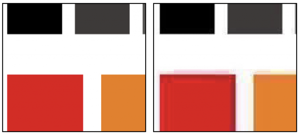
    Small images become blurry when magnified. This is likely because when the color compressed into one pixel is spread into six parts, the algorithm tries to fill the color evenly.

    Feedback

    My mentor explained the purpose of the brief in detail, which helped me to understand the production direction anew.

    week 2

    full.MOV

    Feedback

    Change the way the video is presented to make it more focused on the central content.

    For example, arrange the images chronologically, iterating in different ways each time, mixing image iterations to create a “super image.” The video presentation is strong (this feeling can be continued, but it’s too short; make it longer (closer to make the text easier to read, larger, keyword extraction, perhaps add more images? Add some printing processes (add some very close-up pixel images) to make the article readable while still showing the overall picture), add some printing sections to strengthen the connection between the two.

    week 3

    New deformations are obtained by moving the original object during scanning, and the iterations are then used for the next movement.

    When the movement speed is high, a ray of light will appear in the center of the image.

    —————————Literature Analysis—————————–

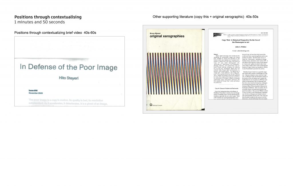
    Steyerl, H. (2009) In Defense of the Poor Image. e-flux journal.

    Steyerl defines a “poor image” as one that is constantly compressed, copied, formatted, and recombined during transmission. This aligns closely with the image states I generate through a cycle of scanning and printing; the transformation process resembles an image flowing through a network. I believe different image transformation methods are like different transmission methods on a network, each bringing different changes to the image. Only the accumulation of different transformation forms can create a “poor image.” However, unlike a “poor image,” I use the same iterative approach to represent individual processes within the transformation. In my project, I used the text content as material, attempting to demonstrate the edited, moved, misaligned, damaged, and reduced states of the “poor image” described in the article through a cycle of scanning and printing.

    Steyerl’s discussion of the transmission path of a “poor image” also made me rethink the “translation” relationship of images across different media. In my project, scanners and printers act as a language system that constantly reinterprets images. Each transformation redistributes the image’s color, density, and structure according to the machine’s own logic, gradually causing the image to detach from its original content and shift towards a system-generated visual state.

    Steyerl’s concept of a “poor image” helped me understand “distortion” as a state of image existence. The collapse of an image is a transformation brought about by the technological system during transmission. This led me to view the changes in images during iteration as a special kind of image that can only be produced through such iterations. This also led me to focus on the changes in images during iteration; as images travel back and forth between physical and digital media, they continuously accumulate machine traces, forming new structures and visual hierarchies.

    Steyerl mentioned that the sharpness and resolution of an image affect its status in the viewer’s mind. Images establish their own hierarchy through sharpness and resolution. In my project, I used extremely high resolution for each scan; however, with iteration (printing, scanning), the readability of the image gradually decreased. The “poor image” made me think that the high-resolution, unreadable or difficult-to-read images produced in my project might be a new visual effect—clear, yet difficult to discern. This presents a similar logic to Thomas Ruff’s JPEG series project: clear pixel deconstruction, but blurred content.

    Steyerl proposed a form of image value defined by velocity, intensity, and propagation range; a poor image possesses velocity. This inspired me to showcase the changes during the iteration process, making its speed visible. I used the article “In Defense of the Poor Image” as material, presenting it as a video. Through repeated scanning, zooming, disassembly, and printing, I demonstrated the speed of the poor image. By combining the project with the article, I reshaped the visuals using machine language, giving the image speed through video.


    Designer as Author

    The discussion in Designer as Author regarding authorship and the role of the designer has led me to rethink my position as an ‘author’ within this project. The theory of authorship posits that a director establishes their own style through their approach rather than their subject matter. During the initial iterations, my role as an author involved intervening in the system’s input sources and parameters. By setting up a system of scanning, layering and printing, I allowed the images to evolve autonomously within a cycle. The aim of the experiment was to seek outcomes; it seemed I did not possess the identity of an ‘author’. However, as the project progressed, I developed a clearer anticipation of the results of these iterations. The article made me more acutely aware that, even if I initially adopted a neutral stance as a designer, an authorial inclination would inevitably be incorporated into the project as it deepened. In my project, I have incorporated more deliberate design into the resulting images. Initially, I was closer to a system builder or a scriptwriter; I did not know the final outcome of the experiment, nor was I certain how the ‘director’ (the machine) would process the images. As the project progressed and my understanding deepened, I gradually began to identify my own stance; I consciously began to structure the video, becoming both the director and the designer.


    Joachim Schmid — Other People’s Photographs

    The project involves the reprocessing of existing images captured by others; these images have been categorised, with a focus on how images flow within the system. In my project, I have utilised texts from In Defense of the Poor Image as source material, subjecting them to a similar process of categorisation. I attempted to categorise the text’s content into different iterative systems. In this project, the text was utilised both as an image and as written text; that is, it served to convey information whilst also representing variations in the replication of physical entities. This project helped me understand how placing different content together allows me to identify the context of my project through their commonalities and differences. Through the physical iteration of Poor Image in this project, I focused on the circulation of physical images and the distinction in rights regarding digital reproductions.


    Bruno Munari’s ‘Original xerographies’.

    In his book Original Xerographies, Munari explains the principles of electrostatic photocopiers and conducts a variety of experiments using them. The experiments in the book provided me with further direction for my iterative experiments and for introducing contextual elements. By analysing the machine’s principles to understand how it works, the book supplemented my iterative process with more detailed information on electrostatic printers that I had been unable to find, whilst also offering potential avenues for further iteration as a reference for my research. The book’s use of a black-and-white scanner to move images inspired me to experiment with moving images during the scanning process. I introduced a new iterative method involving printing the images that had been moved during scanning and then scanning them again. The experiments on pages 70–73 of the book inspired me to explore further ways of moving images during scanning, exposing me to a wider range of possible image variations and resulting in more images that represent the process of reproduction.


    Thomas Ruff — JPEG series

    Thomas Ruff’s ‘jpegs’ series has deepened my understanding of ‘image translation’. ‘Image distortion’ encompasses not only a decline in quality but also the new structures continually generated by media translation. This is similar to the experiments in my own project involving the cycle of scanning, layering and printing—a series of media-conversion processes that constantly reinterpret the image. By enlarging compressed images, Ruff transforms pixels from ‘hidden units of information’ into the dominant visual structure of the image, making them visible to the naked eye. This inspired me to experiment with halftone dots during the iterative process. Observing the process by which dots evolve from ‘auxiliary structures’ to dominate the image. This work drew my attention to the differences in the fundamental composition of images across different media systems. This reference also challenged my understanding of ‘clarity’. In In Defense of the Poor Image, Steyerl links the ‘poor image’ with low resolution, whilst Ruff’s work demonstrates that even when an image has been severely compressed and degraded, it can still acquire new visual intensity through novel modes of presentation.

    Rubinstein, D. and Sluis, K. (2013)The Photographic Image in Digital Culture.

    In *The Digital Image in Photographic Culture: Algorithmic Photography and the Crisis of Representation*, Rubinstein and Sluis discuss the impact of digital algorithms on images. In my experiments, even high-resolution scanning has failed to prevent the images from becoming illegible. As the article states, digital algorithms carry the subjective structures of the system; the iterated images in the experiment generated new textures, colours and visual densities. The iterations revealed the biases of different systems during digital transformation. Images are constantly recalculated during transmission and processing. The technical mechanisms behind the images are key factors influencing the visual outcome.

    At the same time, the article posits that images and context are inseparable. In my project, I treated text as an image, endowing the image itself with a contextual function. By breaking down the text and iterating it in various ways, I arranged the results in a specific sequence to form a video, thereby allowing the images to constitute the context. However, when text exists in the form of an image, I found that the content it conveys becomes blurred; consequently, I believe that images and context are indeed inseparable.


    Menkman, R. (2010) Glitch Studies Manifesto

    In his manifesto, Menkman emphasizes revealing the underlying structure of media through “destruction and distortion.” In my project, this destruction is not a one-off event; I gradually accumulate it through repeated scanning and printing, causing the image to continuously shift and reconstruct. Unlike a glitch as a complete, final state, my experiment demonstrates a “glitch in progress,” where small “glitches” accumulate one after another, in which errors are constantly produced and amplified. This text helped me understand that errors create a new set of rules, and my process is one of constantly breaking old rules and exploring the boundaries of the new ones.


    Manovich, L. (2001) The Language of New Media. MIT Press

    Manovich points out that all new media are composed of algorithmic structures, and are therefore always in a state of rewriteability. While my project is based on physical scanning and printing, each round still involves algorithmic conversion between RGB and CMYK, and this implicit computational process continuously alters the image structure. This theory helps me understand that even in seemingly “mechanical” processes, algorithms still play a dominant role, causing images to be constantly re-encoded rather than stably reproduced.


    Berger, J. (1972) Ways of Seeing. Penguin

    Berger discusses the transformation of meaning in paintings during the reproduction process. My project extends this issue to the technical level. In repeated scanning and printing, not only does the meaning of an image change, but its structure itself is altered. The original information is gradually replaced by new visual relationships, such as color redistribution and blurred boundaries. This text helped me shift from “change of meaning” to “change of structure,” understanding that reproduction affects not only viewing but also the image itself.

    Benjamin, W. (1969) ‘The Work of Art in the Age of Mechanical Reproduction’

    Benjamin discusses how reproduction weakens the “aura” of art, causing it to lose its traditional value. However, in my project, this process is repeatedly superimposed and transformed into changes in image structure. Through repeated reproduction, the image is constantly reconstructed, generating new visual states and acquiring new “aura.” This made me rethink the meaning of “reproduction”—whether it is a mechanism for producing differentiation and innovation. Perhaps the reproduction does not replace the original, but rather develops a new value based on the original. My experiment can be seen as an extreme amplification of mechanical reproduction, allowing its visual value to be observed.


    Paglen, T. (n.d.) Trevor Paglen: On ‘From ‘Apple’ to ‘Anomaly’. Barbican.

    This article explains how machine vision understands images. In my project, scanning and layering also constituted a “non-human” machine image understanding system. It reinterprets and reads image information through algorithms and device logic. It re-transforms image information by reallocating color channels and iteratively reproducing the image, a method that goes against human intuition. This article helped me understand how images are analyzed and interpreted in different systems.

    Walker, J.A. (2006) ‘Copy This! A Historical Perspective on the Use of the Photocopier in Art’

    John A. Walker’s discussion of Copy Art and xerography in *Copy This!* provided an important historical context for my project. The article mentions that artists viewed the degradation of images during the photocopying process as an advantage; they were more interested in the method of generating new images through a combination of montage distortion, transformation and recopying. This encouraged me, in my iterative experiments with scanning, printing and CMYK layer cycles, to move beyond the pursuit of replication and instead undertake bolder experiments. I attempted to introduce errors (such as movement) during the scanning process. By actively increasing the potential for image variation—including noise, colour shifts, image distortion and deformation—I encouraged the machine system to produce a greater variety of new visual states.

    This text has also challenged my understanding of ‘reproduction’. Reproduction itself can become an active process of image reconstruction. Whilst reproduction in the traditional sense emphasises the sameness of the image and the original, in the context of Copy Art, reproduction sparks an endless stream of creativity. Its potential lies in how people utilise it. The article mentions that artists generate new visual outcomes by moving the original artwork, repeating photocopying, layering images, and altering machine parameters. This is very similar to my own experiments involving adjustments to LPI, control of input complexity, and testing of single-channel colours, and it has provided me with further angles from which to approach my experiments. This article has helped me expand my project from a discussion of the digital dissemination of ‘poor images’ into the context of mechanical reproduction and media history, exploring how reproductive technologies actively participate in image generation.

    Reading list

    Steyerl, H. (2009) ‘In Defense of the Poor Image’, e-flux journal, no. 10.   Available at: https://www.e-flux.com/journal/10/61362/in-defense-of-the-poor-image (Accessed: 14 May 2026)


    Rock, M. (1996) ‘Designer as Author’, 2×4. Available at: https://2×4.org/ideas/1996/designer-as-author/
    (Accessed: 14 May 2026).

    Schmid, J. (2011) Other People’s Photographs. Library of Artistic Print on Demand. Available at: https://apod.li/other-peoples-photographs (Accessed: 14 May 2026).


    Munari, B. (1977) Original Xerographies. Milan: Corraini Edizioni.


    Ruff, T. (n.d.) JPEGs. David Zwirner. Available at: https://www.davidzwirner.com/artists/thomas-ruff/survey/jpegs  (Accessed: 14 May 2026).

    Rubinstein, D. and Sluis, K. (2013) ‘Algorithmic Photography and the Crisis of Representation’, in Lister, M. (ed.) The Photographic Image in Digital Culture. 2nd edn. London: Routledge,

    Menkman, R. (2010) Glitch Studies Manifesto.

    Manovich, L. (2001) The Language of New Media. Cambridge, MA: MIT Press.

    Berger, J. (1972) Ways of Seeing. Penguin.

    Benjamin, W. (1969) ‘The Work of Art in the Age of Mechanical Reproduction’, in Arendt, H. (ed.) Illuminations. Translated by H. Zohn. New York: Schocken Books.

    Paglen, T. (n.d.)Trevor Paglen: On ‘ From ‘Apple’ to ‘Anomaly’. Barbican Centre. Available at:https://www.barbican.org.uk/s/trevorpaglen (Accessed: 26 April 2026)

    Walker, J.A. (2006) ‘Copy This! A Historical Perspective on the Use of the Photocopier in Art’, Plagiary: Cross-Disciplinary Studies in Plagiarism, Fabrication, and Falsification, 1(3), pp. 1–3. Available at: https://radicalprintshops.org/lib/exe/fetch.php?media=copy-this.pdf (Accessed: 14 May 2026).

  • Positions through iterating


    Statement

    This project investigates how images are transformed through iterative processes such as scanning, printing, and color separation. What transformations occur in the image during the copying process?

    By repeatedly performing CMYK color separation, scanning, and printing on an image, minute changes accumulate, eventually manifesting as structured distortion. The results show that information is not simply lost, but redistributed: the dominance of color channels changes, midtones are enhanced, and image structure collapses into dense blocks of color. Even with incomplete initial input, such as a limited number of color channels, the system actively reconstructs missing information rather than preserving the original state.

    Through controlled experiments , changing resolution (pixel density), image complexity, and processing steps. This project isolates different mechanisms within the system. These experiments demonstrate that distortion follows a consistent pattern influenced by both algorithmic processes (color separation and merging) and mechanical processes (scanning and printing).

    Ultimately, the project demonstrates that image reproduction systems are proactive, reshaping visual information according to their own internal logic.


    6 References

    “The poor image is a copy in motion. Its quality is bad, its resolution substandard.”( Hito Steyerl, 2009)

    Steyerl defines a “poor image” as one that is constantly compressed, copied, formatted, and reassembled during transmission. This aligns closely with the state of images I generated through cycles of scanning and printing. In my experiments, images were repeatedly reinterpreted and redistributed in each round of transformation, gradually deviating from their original structure. This text helped me understand that the decline in image quality is not a simple loss, but a transformation process closely related to the technological system in the transmission process, making “distortion” a state of existence for the image—a special kind of image that only digital technology can produce, and revealing the marginalized state of the unique meaning that such images can express.

    “I manipulate, bend and break any medium towards the point where it becomes something new.”( Rosa Menkman, 2010, p.6)

    In his manifesto, Menkman emphasizes revealing the underlying structure of media through “destruction and distortion.” In my project, this destruction is not a one-off event; I gradually accumulate it through repeated scanning and printing, causing the image to continuously shift and reconstruct. Unlike a glitch as a complete, final state, my experiment demonstrates a “glitch in progress,” where small “glitches” accumulate one after another, in which errors are constantly produced and amplified. This text helped me understand that errors create a new set of rules, and my process is one of constantly breaking old rules and exploring the boundaries of the new ones.

    “A new media object is subject to algorithmic manipulation.”
    (Lev Manovich, 2001, p.46)

    Manovich points out that all new media are composed of algorithmic structures, and are therefore always in a state of rewriteability. While my project is based on physical scanning and printing, each round still involves algorithmic conversion between RGB and CMYK, and this implicit computational process continuously alters the image structure. This theory helps me understand that even in seemingly “mechanical” processes, algorithms still play a dominant role, causing images to be constantly re-encoded rather than stably reproduced.

    “When the camera reproduces a painting, it destroys the uniqueness of its image. As a result its meaning changes. Or, more exactly, its meaning multiplies and fragments into many meanings.”(John Berger, 1972)

    Berger discusses the transformation of meaning in paintings during the reproduction process. My project extends this issue to the technical level. In repeated scanning and printing, not only does the meaning of an image change, but its structure itself is altered. The original information is gradually replaced by new visual relationships, such as color redistribution and blurred boundaries. This text helped me shift from “change of meaning” to “change of structure,” understanding that reproduction affects not only viewing but also the image itself.


    “One might subsume the eliminated element in the term “aura” and go on to say: that which withers in the age of mechanical reproduction is the aura of the work of art. This is a symptomatic process whose significance points beyond the realm of art. One might generalize by saying: the technique of reproduction detaches the reproduced object from the domain of tradition. By making many reproductions it substitutes a plurality of copies for a unique existence. “( Walter Benjamin, 1969,p.4)

    Benjamin discusses how reproduction weakens the “aura” of art, causing it to lose its traditional value. However, in my project, this process is repeatedly superimposed and transformed into changes in image structure. Through repeated reproduction, the image is constantly reconstructed, generating new visual states and acquiring new “aura.” This made me rethink the meaning of “reproduction”—whether it is a mechanism for producing differentiation and innovation. Perhaps the reproduction does not replace the original, but rather develops a new value based on the original. My experiment can be seen as an extreme amplification of mechanical reproduction, allowing its visual value to be observed.

    “The system then conducts a statistical analysis of all of those images and breaks them down in to what I think of as primitive components, or primitive shapes.”Paglen, T. (n.d.)

    The article explains how machine vision understands images. In my project, scanning and layering also constitute a “non-human” machine image understanding system. It reinterprets and reads image information through algorithms and device logic. It re-translates image information by redistributing color channels and iteratively reproducing the image in a way that defies human intuition. This reference helped me understand how images are analyzed and interpreted in different systems.


    Bibliographies

    Steyerl, H. (2009) ‘In Defense of the Poor Image’, e-flux journal, no. 10.

    Menkman, R. (2010) Glitch Studies Manifesto.

    Manovich, L. (2001) The Language of New Media. Cambridge, MA: MIT Press.

    Berger, J. (1972) Ways of Seeing. Penguin.

    Benjamin, W. (1969) ‘The Work of Art in the Age of Mechanical Reproduction’, in Arendt, H. (ed.) Illuminations. Translated by H. Zohn. New York: Schocken Books.

    Paglen, T. (n.d.)Trevor Paglen: On ‘ From ‘Apple’ to ‘Anomaly’. Barbican Centre. Available at:https://www.barbican.org.uk/s/trevorpaglen (Accessed: 26 April 2026)

    Week 1.

    At the start of the project, I first considered the direction of the iterations.

    My research questions were:
    How does information gradually shift, be lost, or reconstructed when replicating an image? How does it gradually become distorted? Is this distortion systematic? How are errors continuously generated instead of eliminated? At what stage are errors created? At what stage are they amplified?

    Based on this, I sketched out my iterative system:

    Print each layer separately (on different sheets of paper) → Scan separately → Electronically merge into a single image → Print → Photograph (or scan) to obtain a digital file → Use a computer to split into four files: c, m, y, and k.

    During this process, I made the decision of whether to use photography or scanning. Because my research required controlling variables, analyzing the transformation system, and establishing a comparable iteration system, I chose scanning. Scanning results are more stable, planar, and reproducible. The scanning process is unaffected by ambient light and perspective. Taking photos makes it difficult to determine whether the changes originate from printing or from the photograph itself, and it also hinders the separation of CMYK.

    I tried printing each of the C, M, Y, and K layers separately on different sheets of paper, then scanning and electronically merging them, or printing all four layers onto the same sheet and then scanning.

    Since the digital printing workshop was closed on Wednesdays and there were no available appointments on Thursdays, I tried printing each of the C, M, Y, and K layers separately on different sheets of paper, then scanning and electronically merging them, because the library printers don’t allow paper selection.

    Dot system: I standardized the dot angle and size, planning to try small dots in the first week and large dots in the second week, without modifying the parameters during the iteration process.

    I didn’t set any parameters during the first scan, so when I printed the final product after merging, I found the image to be very blurry. Comparing the four sheets of C, M, Y, and K printed separately, I found the problem was in the scanning process. The scanner’s default setting was 300 dpi, which caused a significant decrease in clarity during subsequent printings. To ensure maximum fidelity, I set each scan to 600 dpi.

    During the iteration process, I noticed the printed area gradually decreased because the machine automatically added white borders with each print, resulting in a smaller image size after each print.

    Binding: I plan to use the original documents from each iteration to show the entire process in chronological order. To make each iteration clearer, I printed codes on the original documents, making the book more systematic and easier to compare.

    I initially placed the codes in the lower left corner of the page, but this position is somewhat unsuitable as they are difficult to see after binding.

    I didn’t change the size because A4 size allows for a clearer view of the changes; a smaller size would make the dots unclear and lose details. Changing the size would only be possible by scanning and then reducing or cropping, which would result in my original documents being iterated again, not meeting my desired presentation.

    I plan to add explanatory comparison pages every 10 pages. These will be enlarged to emphasize the changes, and the last page will include an overall overview comparison.

    When binding the book, I chose not to cut off the white space because after iteration, the reduced space contained new information, and the unprinted area was not fixed. The unprinted white space showed the offset and changes after laser printing.

    Week2

    I discovered an error in last week’s iteration: I didn’t modify the file export settings, resulting in RGB mode after export. This time, I unified it to CMYK mode, reducing color difference. I also noticed that in the previous round, changing the image size and DPI after exporting in Photoshop significantly reduced clarity during printing, leading to faster image degradation. This issue was corrected in this week’s iteration, resulting in very stable toner output colors, eliminating the issue of noise from other colors mixed in with single-color outputs.

    Experiment 1 – Adjusting Halftone Values

    Method: Change the LPI to 38, keep other values ​​unchanged. (Halftone dots become larger during layering)

    Results: After decreasing the LPI (increasing the dot size), the image degradation occurred faster,。 the text and image structure were simplified and reconstructed more quickly. During layering, the dots spread beyond the image, becoming more numerous and deeper in the next cycle.

    Analysis: Larger dots contain more information and are more clearly identifiable during scanning. Combining this with the results of the smaller dot experiment in week one, we can see that the dotting process reduces the amount of information. The second halftone transformation does not retain the original halftone dots; instead, it involves a new reconstruction and re-layering of colors. Therefore, the halftone transformation process is not continuous. Image information is reduced during this process. Large halftone dots, because they can only hold a limited amount of information, accelerate the loss of image information. This leads to the image structure being dispersed more quickly, boundaries disappearing, and colors merging faster.

    Experiment 2 – Input Source
    Method: Iterative processing using medium-complexity and low-complexity images, with other processes remaining unchanged.

    Results: The complexity of the image has some impact on the speed of image collapse, but it is very small. Even with a small proportion of black, the colors become very dark in the sixth round. It can be observed that during layering, the system tends to strengthen midtones, causing the overall color to become “dirty.” Large areas (boxes) are more stable than details (text).

    Experiment 3 – Removing an Iterative Process to Test the Source of Change

    Method: Remove the “electronic merging” step and replace it with “physical printing multiple layers onto one sheet and merging”. Iterate 3 times (this is sufficient). Note: This experiment used a studio printer (more precise than the library printer; the library printer doesn’t allow paper selection, so the studio printer had to be used).

    Position: After iteration, the difference from digital compositing was observed: image misalignment was greater during multiple printings. The reason is speculated to be the paper feeding method. The library printer uses its own paper, which is more fixed in position. The studio printer uses a free-size paper inlet, so the paper sometimes goes inwards and sometimes outwards, resulting in more noticeable misalignment between different layers in the final image.

    Color: During digital merging, color saturation did not decrease; the colors appeared multiplicative when superimposed. It is speculated that the logic of physical superposition printing is an incompletely transparent overlay, where the previous layer affects the color of the next layer, but some of it is also covered, so saturation does not increase and may even decrease after superposition. When iterating in this way, the saturation decreases to a certain extent with each iteration. (Combined with Experiment 4 below, it is speculated that the saturation decrease originates more from the printing process; the exposure during scanning should have no effect on saturation.)

    Experiment 4 – Removing an Iteration Process to Test the Source of Change

    Method: Remove layers, simply scan and print, scan and print again.

    Result: Color saturation is stable and does not decrease. A gradual shift from high-purity CMYK to RGB can be observed. Simultaneously, even without other operations, the image naturally collapses during the iteration process.

    Analysis: This image collapse is not caused by digital layering and merging. However, the way the image collapses differs from the form of layering. It can be concluded that digital layering and merging affect the form of image collapse.

    • Iterative Printing of Black Single Channel

    It is speculated that its distortion originates from the influence of other colors during the iteration process. Would removing the influence of other colors each time result in greater stability?

    Experiment Number 4

    Method: Remove other color layers each time, outputting only black.

    Result: It was found that the amount of color distinguished each time was the same, and the image still collapsed. It can be observed that black exhibits a color bias after each printing and rescanning. Black is assigned to blue and yellow.

    Analysis: Since toner contains black, assuming black doesn’t have much color bias, the change in black color must occur during the scanning stage. During scanning, CMYK shifts to RGB, and a portion of black is allocated to blue and yellow; this process occurs in every scan.

  • Methods of Iterating

    written response

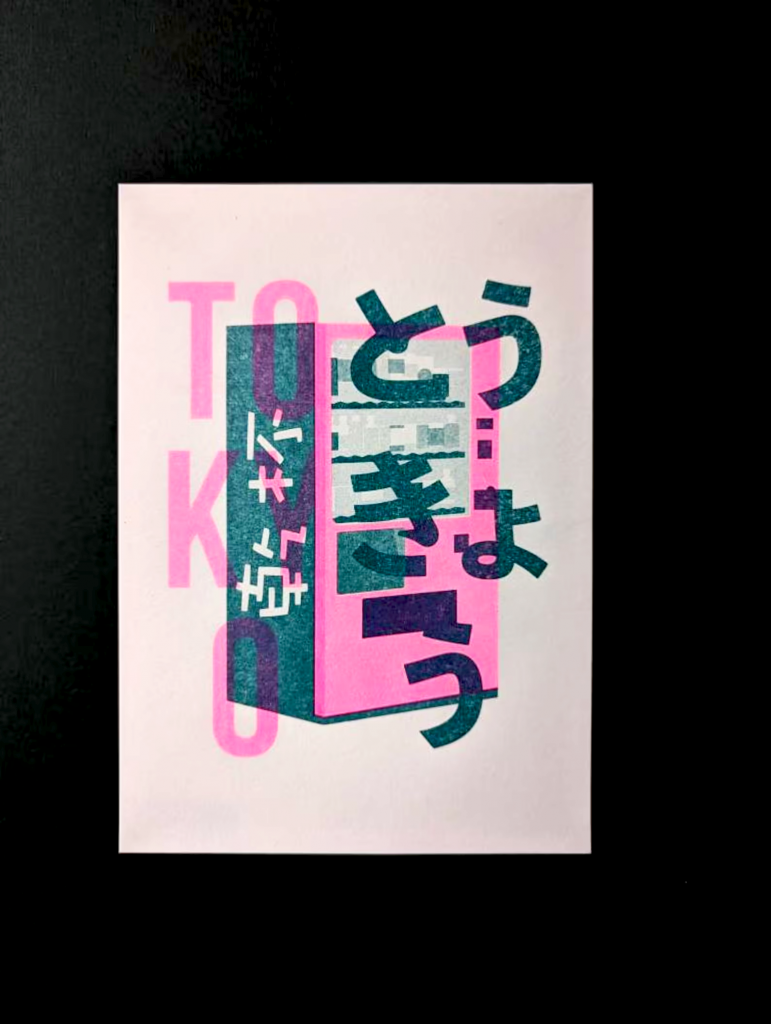
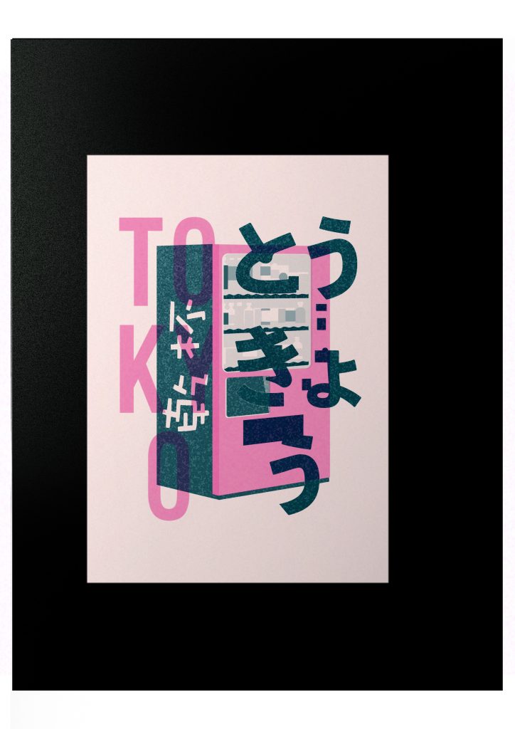
    The artwork I chose to reproduce was printed using Riso ink. It was photographed against a black background, using both Fluopink and Teal Riso inks, and was an A5-sized painting. My initial choice for the reproduction tool was Riso, but I ultimately used a laser printer.

    The book *Adhocism: The Case for Improvisation* mentions that ad hocism utilizes existing systems to quickly and efficiently solve problems for a specific purpose.

    As graphic designers, we often encounter unexpected situations. We need to find materials around us to solve problems on the fly. What can we utilize? My “iteration” was goal-oriented, aiming for a near-perfect reproduction of the Riso artwork. When unforeseen circumstances prevented me from using Riso, I had to use other solutions.

    Laser printing, as a clearer, more precise, and faster printing tool, works by transferring toner through electrostatic discharge and heating, using laser scanning to generate high-quality text and images. Compared to Riso prints, its main advantage is its ease of preservation and resistance to long-term storage. I tried to reproduce the texture created by the combination of Riso ink and paper in the original artwork as accurately as possible in the digital version used for printing. This is because laser printing uses toner transfer instead of ink, which means it’s difficult for the ink to penetrate the paper, requiring additional texture. Riso printing requires separate master plates for different colors, and the overlapping areas of two colors will produce an overprinting effect. I imitated the Riso printing method, printing each color separately. After experimentation, I found that even with more precise laser printing, the pattern’s position on the image shifts after printing the same pattern twice. This is an unavoidable deviation caused by the two printings. Laser printing can also naturally produce the effect of two colors overprinting, but this effect is different from the effect of printing a single image by overlaying colors on a computer. Using a more precise, one-time printing machine like laser printing for repeated printing will also make it unstable, like Riso. To enhance the randomness of the misalignment, one could eliminate the chuck used to hold the paper in place, making the printing misalignment more random, or use larger sheets of paper for printing and then cutting, which would increase the misalignment. After numerous experiments, I discovered that the printing effect of laser printing varies depending on the printing order. Unlike the randomness of Riso, the randomness of laser printing lies in the uncertainty of color. When using laser printing, if the first layer of color is covered by a large area of ​​new printing, a burnt and mixed effect will appear at the edges and inside of the image, creating a blurred effect. This is presumably because the toner on the paper is reheated before it has completely cooled. If the printing order is reversed, this burning effect will only appear inside the image. To maximize the capabilities of laser printing to achieve the Riso printing effect and reduce color instability, one can try using four-color printing, separating the colors into CMYK and printing them separately. This will ensure color stability and saturation.

    Riso is considered a handcrafted, unreproducible, and romantic characteristic due to the slight misalignment in each output. We even strive for this misalignment effect when using Riso. However, even using precise laser printing with the same single-color printing method will produce the same result. So, when the Riso misalignment effect is reproduced using laser printing, will people still feel its unique handcrafted quality? After printing in large quantities, I became even more aware of the low cost of Riso printing and the inflated price tag inflated when people perceive the effects of machine-made products as art and handcrafted. Comparing the two printing machines, when their printing processes are identical, they exhibit consistency in terms of error. However, the value of two weeks’ worth of printing differs significantly. If laser printing were used to implement the Riso printing method, could it also generate a higher value due to its unique sequence and random burning effects?

    WEEK 1 Weekly Process

    I am reproducing this artwork.

    As it was printed using a Riso process, my reproduction will broadly involve two stages: image creation and printing calibration. I employ AI software for graphic design, as its vector capabilities facilitate adjustments and printing. The image’s low resolution prevents me from clearly discerning whether the surrounding diffusion stems from blurring or natural ink-paper interaction, though the file’s clarity will aid subsequent processing. I am reproducing a Risograph work, including the colour registration errors inherent in its printing process. But how might I prevent introducing new errors during my own printing?

    During the drawing process, I realised that to achieve a print size as faithful as possible to the original, the canvas needed to be larger than the actual required dimensions. This ensures the final cut-out sits precisely in position. As Risograph printing requires each colour to be a separate file, I created two distinct layers for drawing the fluo pink and teal patterns respectively. However, I realised that to closely match the original image, it’s best to create separate layers for colours of varying depths, facilitating adjustments during printing.

    Additionally, whilst drawing the images, I encountered difficulties with symmetrical patterns featuring curves, such as the letter O. The AI tools proved inconvenient for simultaneous adjustments, necessitating the use of the Symmetry function. However, this function also proved cumbersome for partial modifications. Furthermore, I discovered that AI cannot select the angle adjustment handles directly for numerical tweaking; instead, one must select and drag manually. It also cannot simultaneously select outward extensions to achieve symmetrical angles.

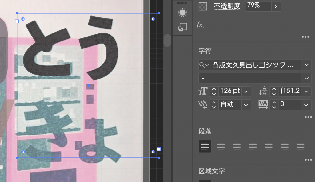
    During replication, I observed that both the Japanese and Chinese text in the original work employed identical fonts. I surmise the English text likely used the same font, though I failed to locate it. This raises the question: are these fonts freely available for commercial use? Once incorporated into a finished piece, I instinctively assume they represent custom designs by the artist. But is this truly the case? Does the process of typesetting and printing erase the provenance and value of the typography? In replicating this Risograph print, have I performed another act of authorlessness by bypassing the process of selecting colours and trial-and-error?

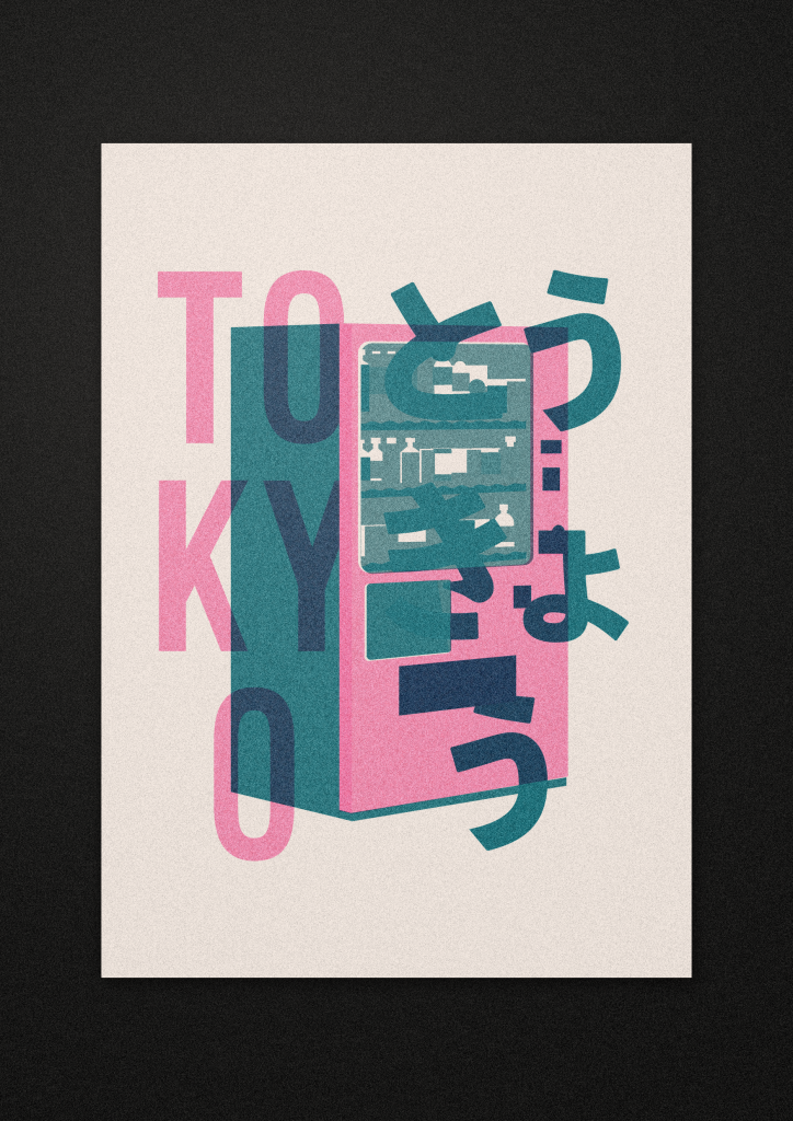
    These are questions I cannot resolve. An unforeseen circumstance arose during the Risograph printing process. The studio tutor was absent due to illness, leaving the studio understaffed and preventing me from proceeding with Risograph printing. I was thus compelled to seek alternative printing methods. The options I considered were inkjet printing and screen printing. Screen printing faced time constraints, and due to an error in my file submission, it ultimately could not proceed. I then attempted inkjet printing. However, I discovered that inkjet printing, despite being a more expensive method, struggled to achieve the fluorescent pigment effect characteristic of riso printing. Simultaneously, I experimented with recreating the riso effect in the photograph using Photoshop. The digital version may well prove the closest approximation.

    WEEK 2 Weekly Process

    I endeavoured to replicate the original as faithfully as possible in Photoshop, incorporating additional textures to recreate the unique grain produced by the interplay of Riso ink and paper. I also retained separate layers, finding it intriguing to contemplate how replicating the Riso process with a laser printer might yield results.

    Riso printing requires separation into layers, with distinct master plates for each colour. Printing these plates individually creates an overprint effect where overlapping areas blend. Would employing the same method with a laser printer yield similar overprinting? Would this result match the effect of applying a Multiply blend mode directly in Photoshop before printing? I conducted an experiment. I subjected the laser printer—a precise, single-pass printing machine—to repeated print runs. I separated the printed content into layers, printing each colour individually to induce instability. RISO’s defining characteristic is its inability to mass-produce identical copies; each sheet exhibits unique misalignments and deviations. But if laser printing achieves this effect, might each reproduction become a new original? This week’s preliminary test results indicate that repeated printing causes colours to deviate further from the original file. The overprint effect from two laser prints differs from that achieved using the “Multiply” blending mode in digital software.

    Through experimentation, I discovered laser printing can achieve overprinting effects. Repeatedly printing the same colour on a single sheet yields deeper hues. I attribute this to the school’s laser printer lacking white ink mixing capability, resulting in non-opaque coverage that prevents layer-to-layer masking. Even with more precise laser printing, positioning shifts occur when identical patterns are printed twice. This inherent deviation from double printing is unavoidable. Could the slight misalignment in each Riso output, along with its colour registration errors and inherent irreproducibility, be romanticised as a distinctive feature? It must be noted, however, that laser printing cannot replicate the fluorescent characteristics of Riso colours. When laser-printed colours overlap in small areas, an overprint effect occurs. Yet during one test, I observed that after printing a small area, overprinting a full-surface layer produced an effect resembling a smudged plate. Having investigated laser printing principles—where toner is fused onto paper by heat—I hypothesise this smudging occurs when toner particles, not yet fully cooled, are reheated. Time constraints prevented further experimentation, so this remains conjecture.

    Additionally, I failed to test whether repeated layered printing—applying multiple or even triple layers—would yield consistent results. If larger sheets were used to print multiple layers in a single pass, would the misalignment and speed significantly increase? Would altering the printing sequence yield the same result? Would smudging occur again? When printing multiple layers, would the colour deviation values increase? How much would this differ from printing a single layer directly?

    week3 written response

    The artwork I chose to reproduce was printed using Riso ink. It was photographed against a black background. It used two Riso inks, Fluopink and Teal, and was an A5-sized painting. My initial choice for the reproduction tool was Riso. However, I ultimately used a laser printer, a clearer, more precise, and faster printing tool.

    The book Adhocism: The Case for Improvisation mentions that ad hocism utilizes existing systems to quickly and effectively solve problems for a specific purpose.

    My “iterations” were goal-oriented, aiming for a near-perfect reproduction of the Riso artwork. When unforeseen circumstances prevented me from using Riso, I had to find materials from my surroundings to solve the problem and achieve my objective.

    In the digital version used for printing, I tried to reproduce the texture created by the combination of Riso ink and paper in the original artwork as closely as possible. This is because laser printing uses toner transfer instead of ink, meaning it’s difficult for the ink to penetrate the paper, requiring additional texturing. Riso printing requires separate master prints for different colors, and overlapping areas between colors create an overprinting effect. I mimicked the Riso printing method, printing each color separately. I’ve found that even with more precise laser printing, the same pattern doesn’t perfectly align after two prints. This is an unavoidable deviation from the initial print, which naturally produces a two-color overlay effect. This effect differs from the final product obtained by printing a pattern using computer-generated color films in a single pass. Using a more precise, one-time printing machine like laser printers for repeated printing will also lead to instability, similar to Riso. To increase the randomness of misalignment, you can remove the paper clamps in the laser printer, making the misalignment more random. Alternatively, using larger paper for printing and then cutting will increase the offset.

    In Riso printing, if the machine moves the color positions, the color at the original position will appear as a lighter shade during printing. This is because the color at the previous position hasn’t been completely consumed after the movement. The workshop instructors call this “ghosting.” After multiple prints, the “ghosting” disappears. In laser printers, the colors differ with each print due to changes in the printing order. The printed colors are influenced by the previous layer of color. I believe this is the laser version of “ghosting.” The randomness of laser printing lies in the uncertainty of color mixing. When the first layer of color in laser printing is covered by a large area of ​​new printing, a burning and mixing effect, similar to edge burning, occurs at the edges and inside of the image, creating a blurred effect. This is presumably because the toner on the paper is reheated before it has fully cooled. If the printing order is reversed, this burning effect will only appear inside the image. To maximize the capabilities of laser printing and achieve the Riso printing effect while reducing color instability, one can try using four-color printing, separating the colors into CMYK and printing them separately. This ensures color stability and saturation.

    Riso is considered to have a handcrafted, unreproducible, and romantic characteristic due to the slight misalignment in each output. Some even strive to achieve this misalignment effect when using Riso. However, when I tried printing with a temporary tool, a so-called precision laser printer, and following the same printing process as Riso, they exhibited consistent errors. After printing in large quantities, I felt even more strongly the low cost of Riso printing and the inflated price of the naturally produced mechanical effect when people pursue it as art and handcrafted. The two printing machines produce vastly different values. If laser printing were used to implement RISO printing, could it also generate a higher value due to its unique sequence and random burning effect?

    Reference

    Jencks, C. and Silver, N. (2013) ‘Foreword to the MIT Press Edition: The Style of Eureka’, in Adhocism: The Case for Improvisation. Cambridge, MA: MIT Press, pp.vii

  • Methods of Translating


    WRITTEN RESPONSE

    blog

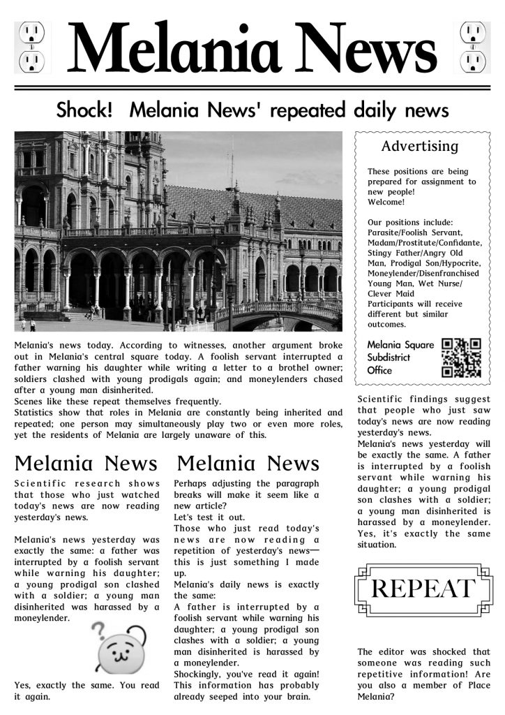
    In this project, I contemplated the possibilities of “translation”. This extends beyond mere linguistic rendering of text. When translations are adapted to fit temporal contexts, they can yield profoundly different outcomes. Modifying specific formats—such as news articles or book recommendation blurbs—can significantly alter the content conveyed. Through experimenting with diverse translation approaches, I believe such methods can broaden a project’s scope, enabling graphic designers to think outside the box when facing creative impasses.

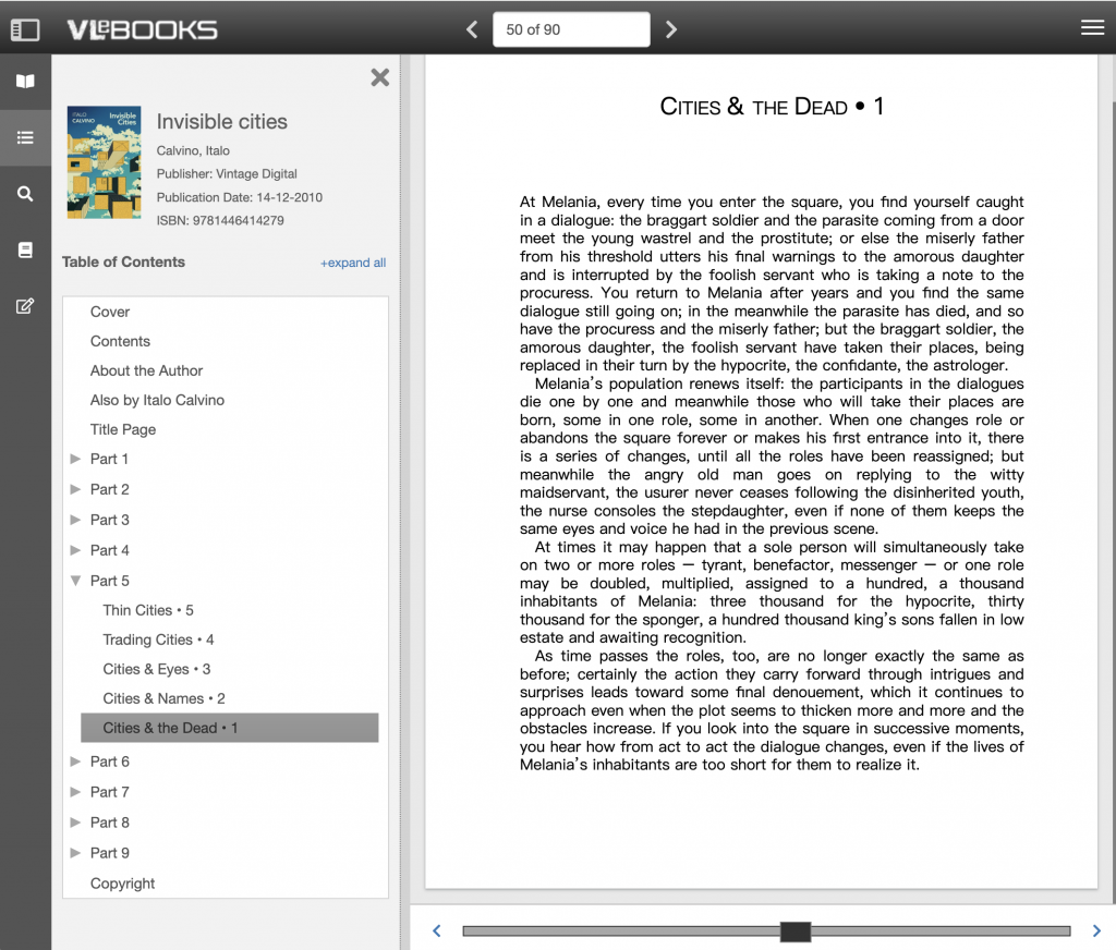
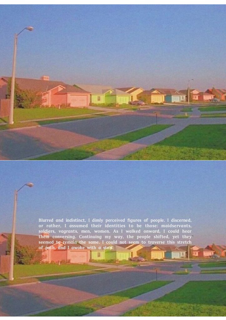
    The source text selected for translation in this project is the final chapter of the fifth section from Italo Calvino’s Invisible Cities. This choice was not driven by any particular rationale, but rather a random selection. The core of this passage lies in its depiction of the inhabitants of Piazza Melania, who play similar roles, repeating identical lives generation after generation. A single role is assigned to hundreds or thousands of individuals, yet those caught within this cycle remain oblivious to this fact.


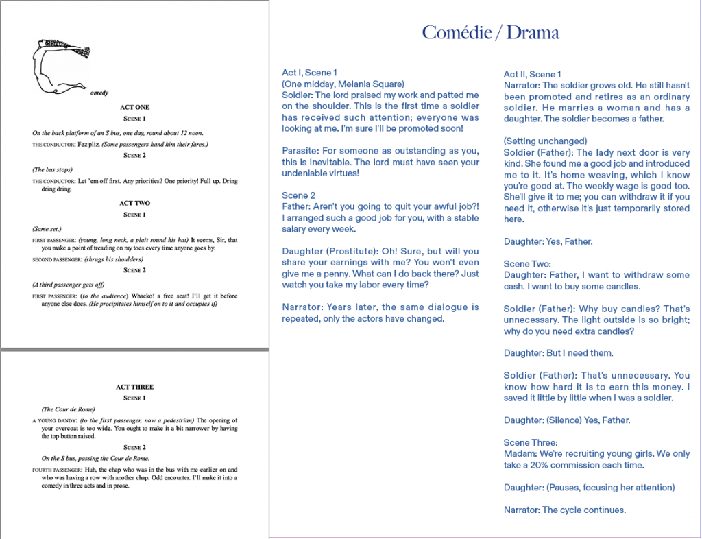
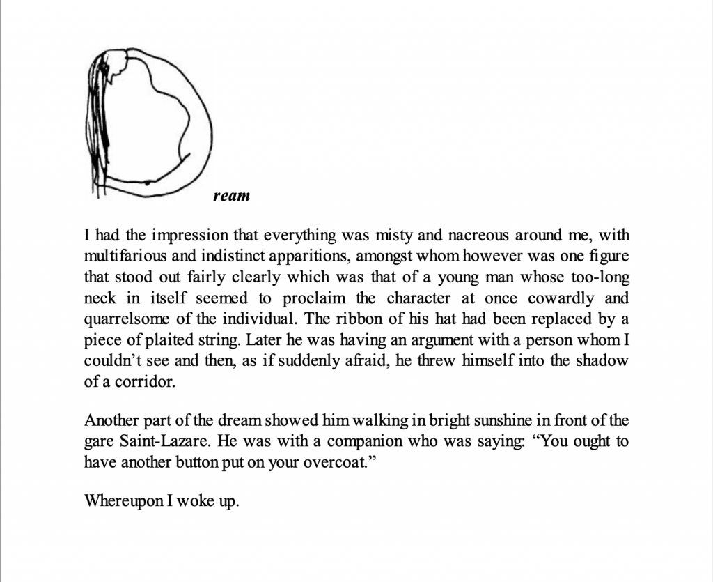
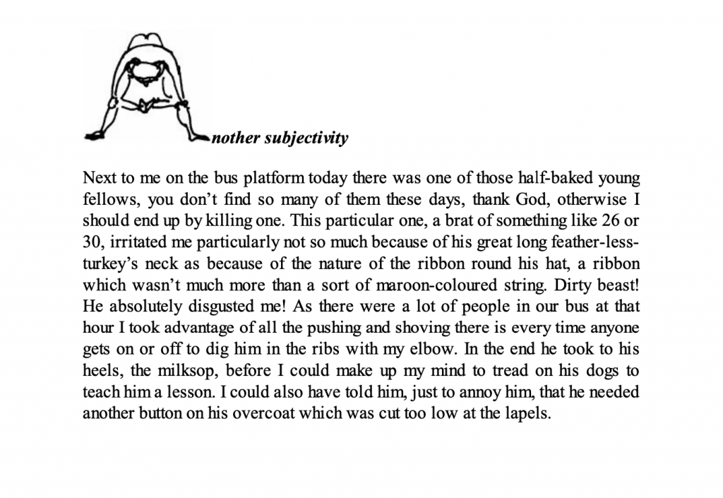
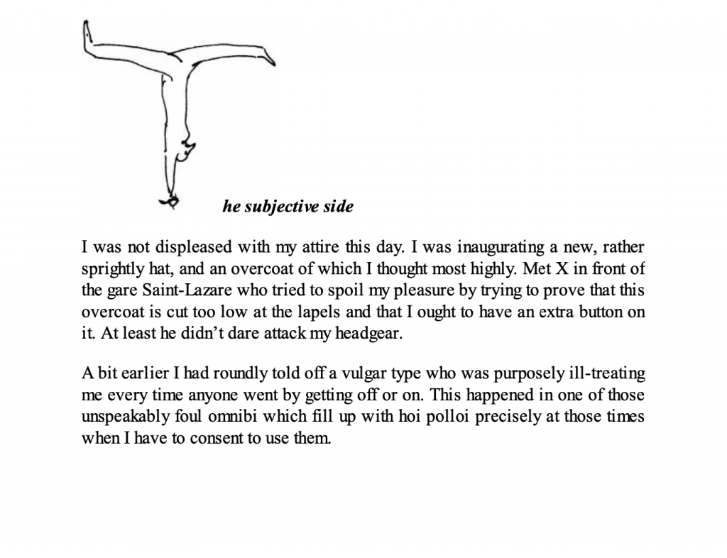
    For the initial “filter”, I experimented extensively with styles from Raymond Gernot’s exercises: Comedy (drama), Surprises, Prognostication, Dream, The Subjective Side, Another Subjectivity, surprise, and my own addition, Report.

    For “Drama”, I adopted the format from the style exercises. As the source text lacked specific dialogue, I selected characters mentioned in the article and fabricated conversations based on their described personalities. This approach better aligned with the drama format, using character exchanges to depict the repetition and cyclical nature of people’s lives.

    The left side shows the articles from the style practice section on drama, and the right side shows the articles I translated from the drama articles I referenced.

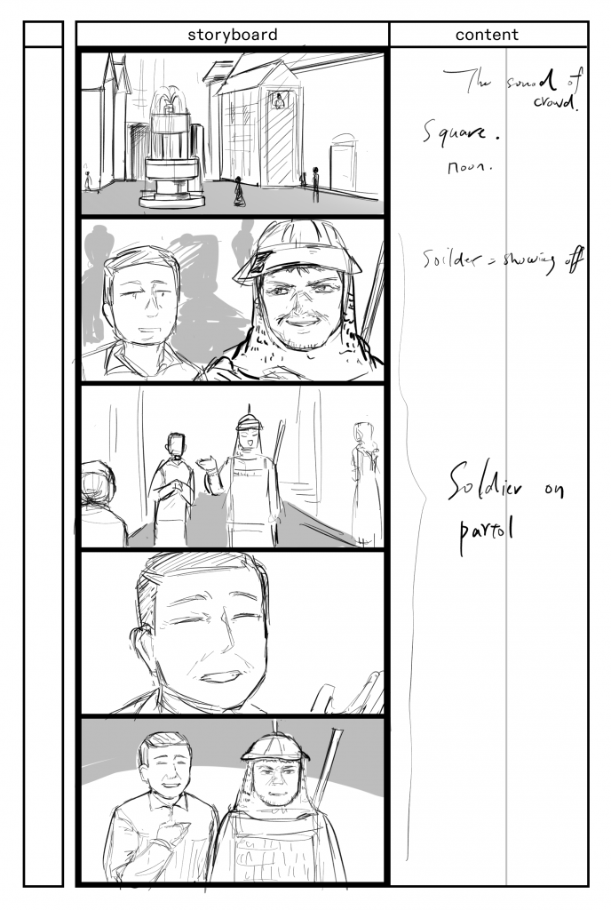
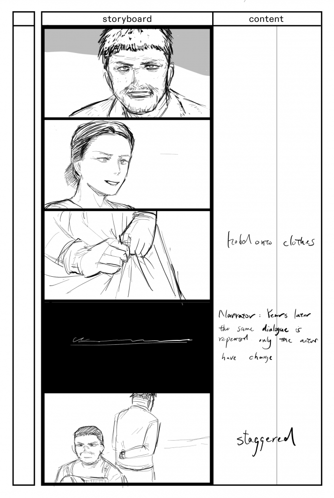
    In further translation to heighten drama, I linked this to storyboarding. As dramatic scripts are also employed in film/animation narratives, combining storyboards with text amplifies the dramatic filtering effect.

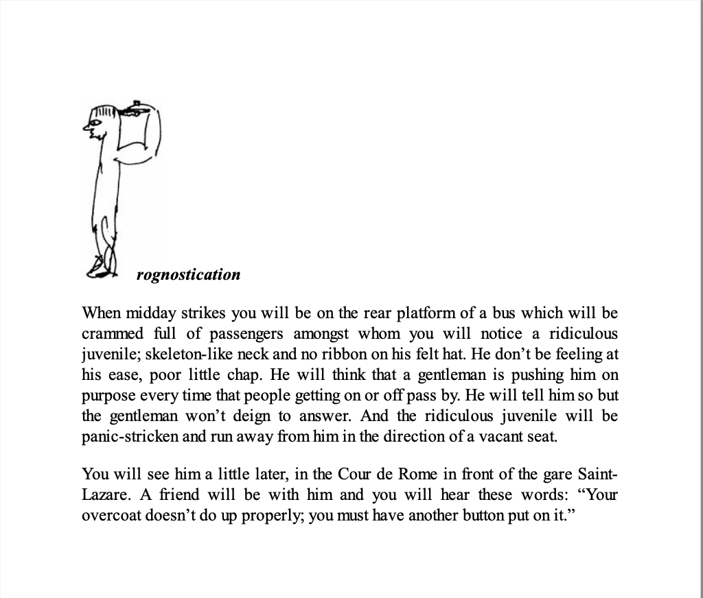
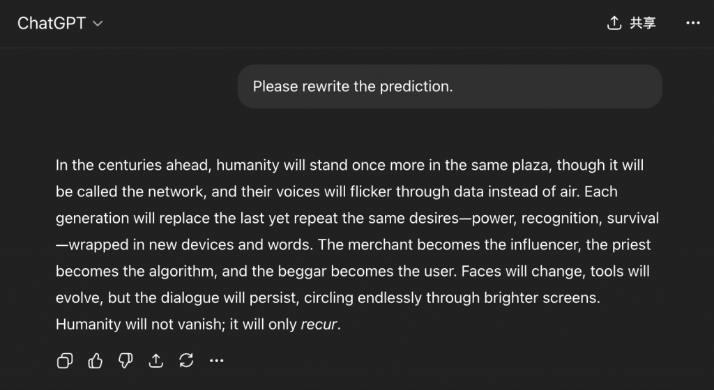
    On the left is the translated version of the prophecy I referenced; on the right is the prophecy I practiced.

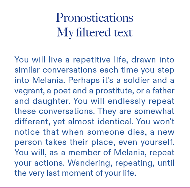
    In further translation, I amplified prophecy by setting the timeline in the future. The AI delivers prophecies, adjusting the original’s timeframe to the present day. It foretells the cyclical, repetitive lives of modern people.


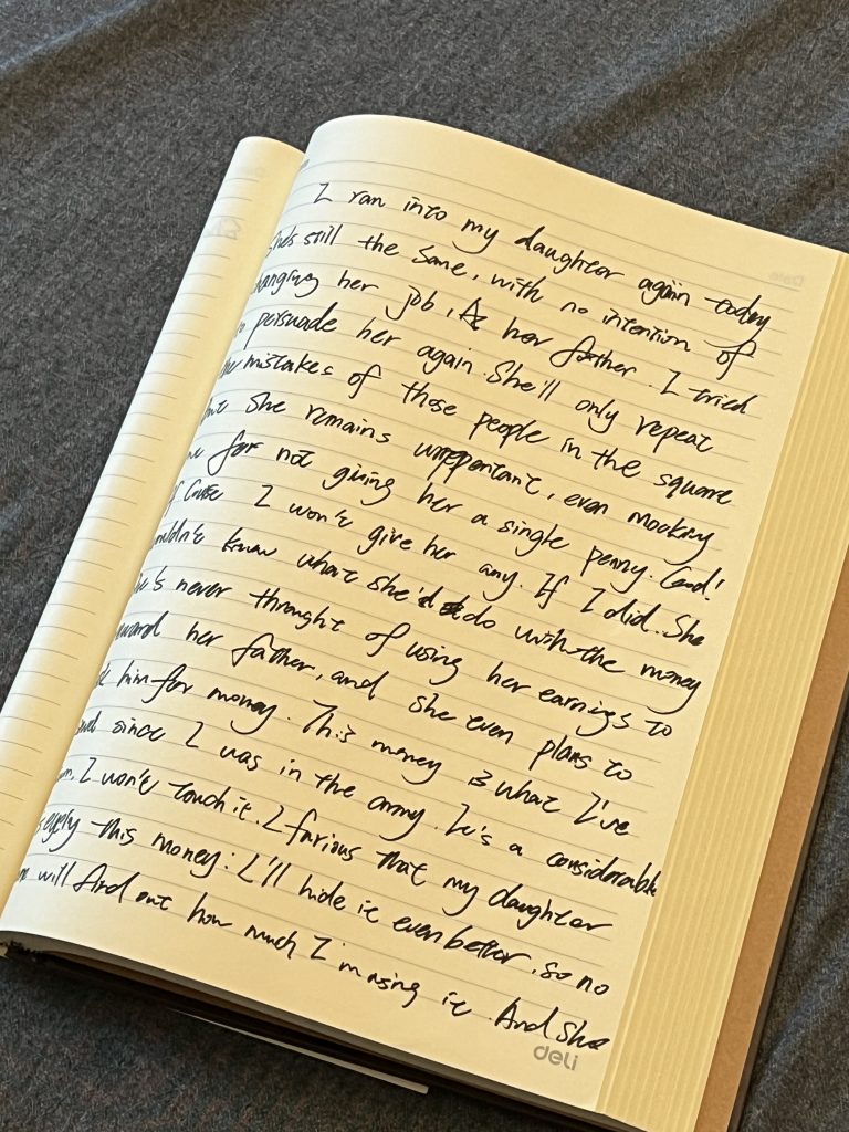
    To enhance the ‘Another Subjectivity’ style, I chose to express it through diaries. I believe this approach better suits characters with markedly unconventional personalities, where readers might struggle to empathise. I aimed to heighten the sensation of “reading” or ‘observing’ another’s perspective, hence the diary format conveys the feeling of peering into someone else’s inner world.

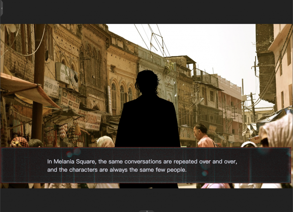
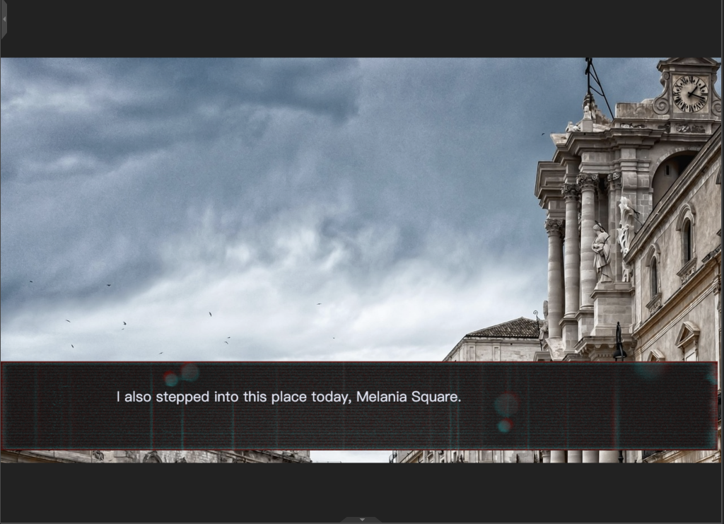
    For the ‘The Subjective Side’ style, I opted to integrate it with visual novel games.

  • Methods of Cataloguing

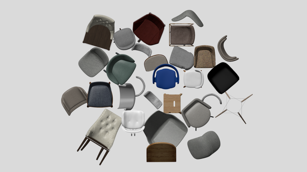
    This WRITTEN RESPONSE selected the chapter “Census, Map, Museum” from Anderson_B’s Imagined_Communities book, analyzing it using the “Inventory” cataloging method. For this project, I attempted a census of chairs and categorized the SETS I selected.

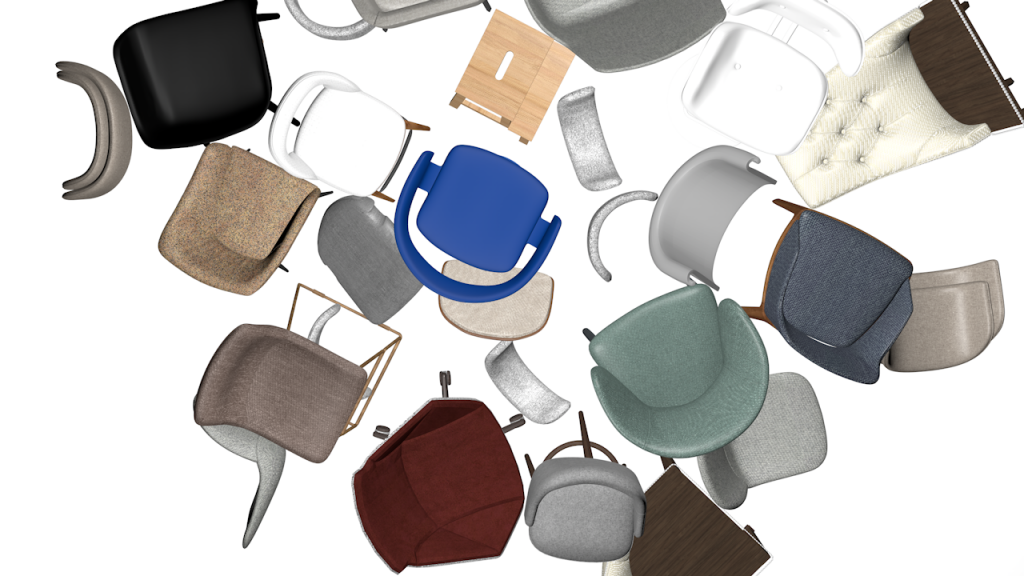
    Based on the Imagined_Communities census, I selected 100 chairs from the 3dsky model website for classification, initially listing some potential characteristics that could serve as criteria for classification, with the intention of later establishing “ethnic groups.”

    I established a basic classification method for chairs, using the information available on the website to create a basic categorization.

    -File format. File formats can limit downloaders’ uses. I categorized them into .OBJ, FBX, and others.

    -Material: The components that make up the chair.

    I replicated the modeler’s process for modeling a chair, considering the key considerations from a modeler’s perspective.

    Material

    Components
    -The connection between components and file formats led to new categorizations, such as whether the model is a single piece or a modular assembly. A one-piece model cannot be disassembled, so it is classified as a separate category.
    Connection Method
    Based on these three factors, I developed a deeper focus on chair classification: Sustainability

    Definition: Can it be reused over the long term?

    Based on this general category, I then expanded into other categories:

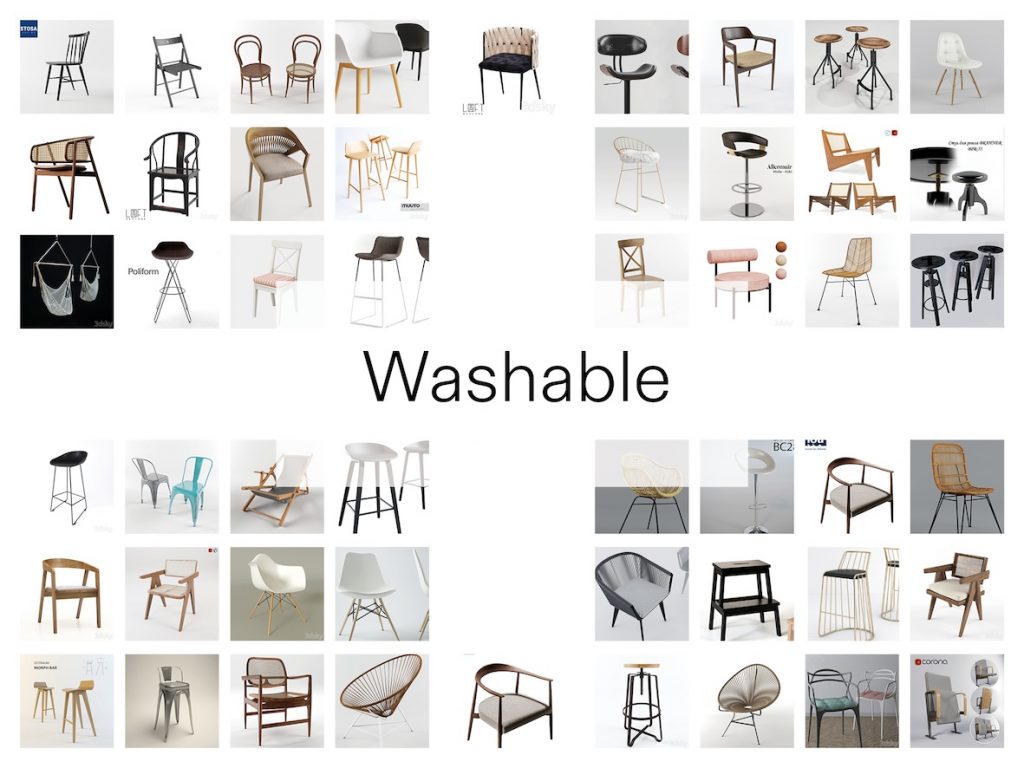
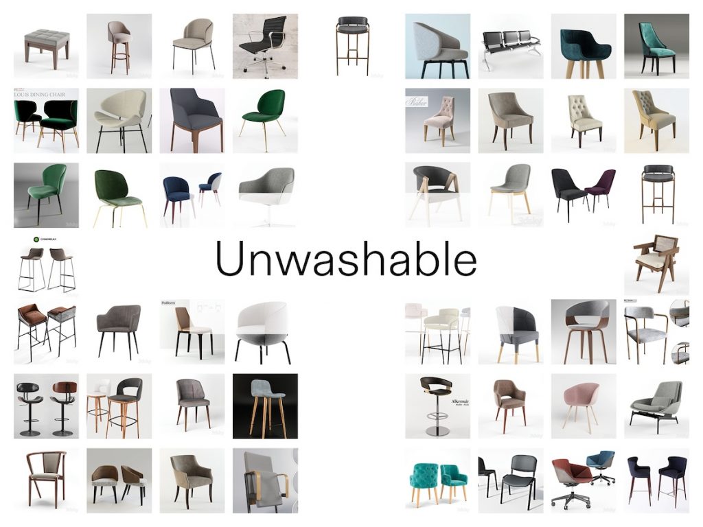
    · Washable (Yes/No)

    Can it be washed and reused after contamination?

    · Disassembly (Yes/No)

    · Connection Method (Screwed/Glued/Welded)

    Screwed chairs allow for easy and separate replacement of components.
    · Material Composition (Single Material/Dual Material/Three or More Materials)

    Single materials are easy to sort and recycle. A single material with too many “mixed components” (e.g., plastic + metal + fabric) is nearly impossible to recycle, as each component requires a different treatment.

    · Design (Universal/Modern)

    After categorizing these, I received feedback and experimented with reorganizing unsustainable chairs.

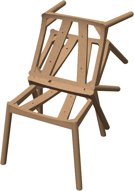
    Through the work 100chairs in 100 days, I saw more chairs made from various components. These were defined as chairs. This reminds me that the modeler’s construction of a chair also defines the chair category, just as a census defines race. I, too, define chairs.

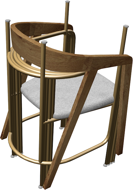
    My goal in reassembling is to create new, comfortable, and sustainable chairs. By disassembling and reassembling the components of unsustainable chairs, I reestablish a new category, reshaping a new “race” of chairs. However, this also leaves behind many unusable parts. I group these discarded parts with models that cannot be modified. I wonder if I can create a new category again—this is something I’ll continue to explore in the future.

  • Methods of investigating

    WRITTEN RESPONSE

    week 1 Work Log

    This paper focuses on exploring methods of observation. It examines how painting, photography, and textual documentation can be employed to conduct effective investigations of a region, considering the distinct insights each medium yields. The research process outlined is summarised for application by graphic designers.

    Reading the required bibliography provided in the briefing, Georges Perec’s Species of Spaces and Other Essays, the chapter on Streets mentions the method of observation: ‘Force yourself to write down the things that interest you least, the most obvious, the most commonplace, the most tedious.’ In Towns, it states: “Abandon all preconceived notions. Do not think in ready-made terms; forget the pronouncements of town planners and sociologists. This proves a highly effective approach.

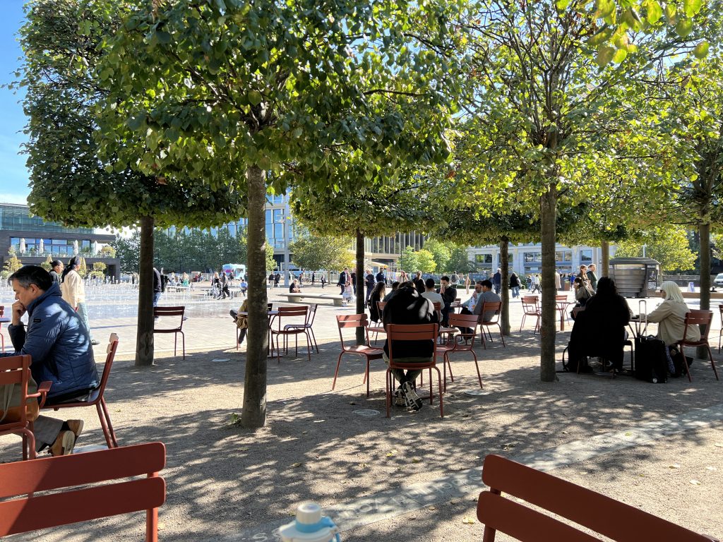
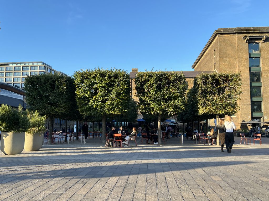
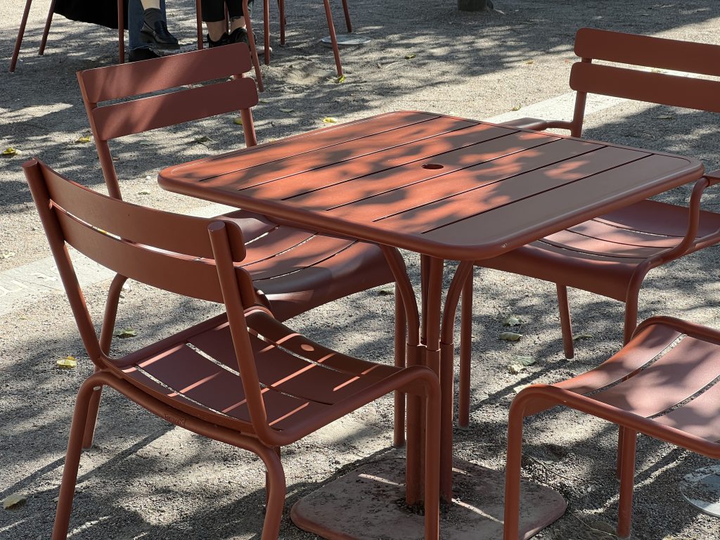
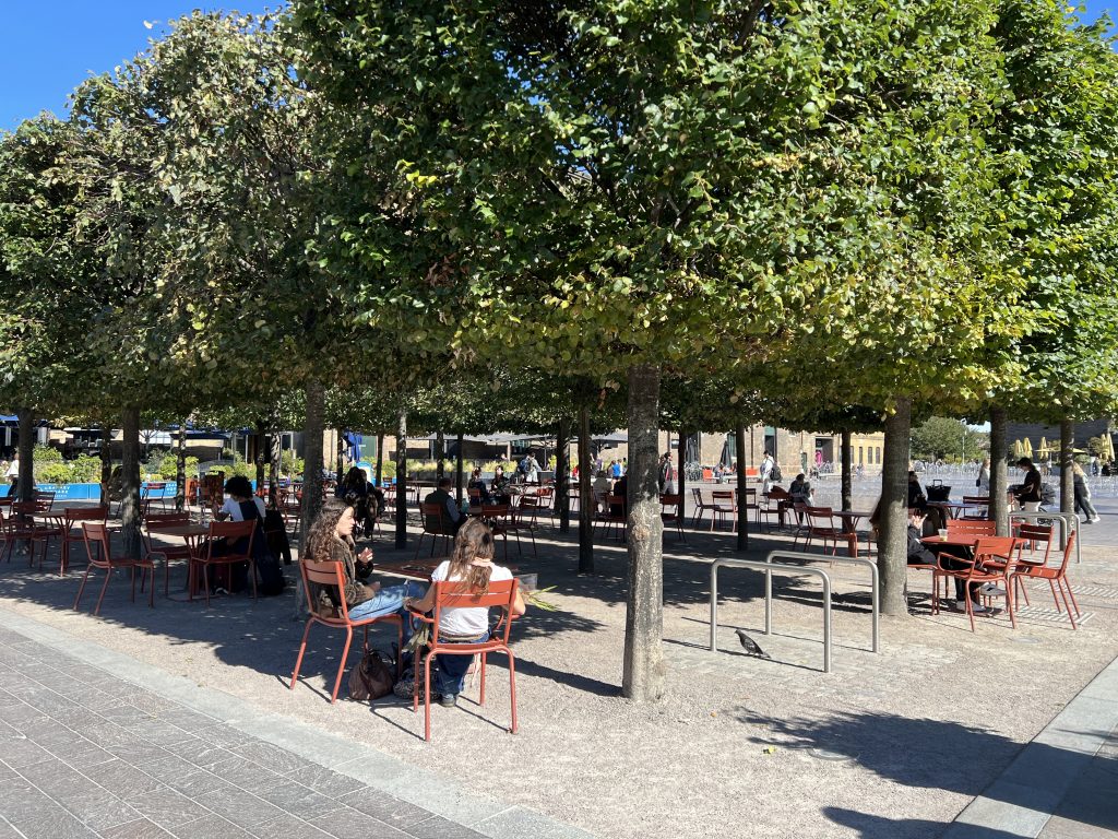
    In practice, I endeavour to set aside existing knowledge and observe locations at close quarters. Immersing myself within a site, I experience its unchanging foundational elements—furniture aesthetics, ground composition, tree forms—documenting these observations through textual descriptions and sketches. Subsequently, I focus on dynamically changing elements within the environment, recording human and animal movements within the space. Employing the Street Method, I append timestamps to dynamic observations alongside all factual details witnessed, eschewing subjective conjecture. Compared to photographic documentation, writing and sketching proceed at a slower pace. I believe this approach filters out extraneous information, retaining features we deem significant. This method also facilitates greater focus on points of interest and recurring elements, thereby reinforcing cognitive understanding.

    To prevent subjective thoughts from unduly influencing observation, I subsequently departed the location to observe from a higher vantage point at a greater distance. This approach supplements our understanding of the site. Firstly, it provides clearer recognition of the site’s planar structure, which I utilised to create a floor plan.

    I then observed changes in the environment’s unchanging elements. Taking my observation site as an example, chairs constituted such unchanging elements. However, chairs are moved by people during use. Observing from a distance allowed clearer tracking of their movement patterns. Here, I primarily employed photography for documentation. While distance reduced image quality, my distant perspective required less detail, and the camera excelled at capturing fleeting moments.

    Combining close and distant observations yielded an initial understanding of the area’s structure.

    Subsequently, I organised my findings to identify points of greatest interest. This was also where I felt lost. I struggled to articulate my perspective, merely savouring the act of observation. Yet through discussions with my supervisor and peers, I selected two directions for deeper investigation. Thus, I consider dialogue with others a crucial investigative step, revealing gaps in my own understanding.

    Moving forward, I increasingly employed photography to gather more directional information. However, as images inevitably capture extraneous details, I would crop out irrelevant elements post-observation to emphasise key points.

    ‘All dimensions of inequality are equally important. Not merely important, they are real and inextricably linked.’ Afonso Matos (Ed.), Who Can Afford to Be Critical? Set Margins, 2022

    At this stage, I believe it is appropriate to focus on the unusual, the unconventional—or rather, to pay particular attention to minority groups. At this location, I specifically observed: What distinctive sitting postures were employed? Why were these alternative postures adopted? Were they comfortable? Targeted observation and documentation were conducted for specific instances.

    Hal Foster’s Design Crime highlights the necessity of activity space. My interpretation is that when design fully accommodates one specific need, it inevitably curtails other directions for users to freely extend their usage. Consider chairs: if a location’s seating undergoes iterative redesign based on observed sitting postures to better accommodate them, might this inadvertently diminish users’ desire to use chairs at all?

    Determining the appropriate balance between optimisable, iterable elements and spaces that should retain their freedom requires iterative testing and observation.

  • Hello world!

    Welcome to myblog.arts. This is your first post. Edit or delete it, then start blogging!